When you want your custom component to accept other blocks, configure your component with children. The following video demonstrates a custom tabs component that accepts Builder blocks as content. Each tab receives a unique block that the user drags and drops in.
To get the most out of this tutorial, you should have the following:
- An app you've integrated with Builder
- Familiarity with using custom components
The most fundamental use case is a basic container that accepts draggable content. This section demonstrates a hero component that users can drag and drop other blocks into.
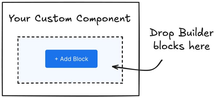
Register the component with Builder, specifying that it can accept children:
import {
Builder,
withChildren
} from '@builder.io/react';
import type { PropsWithChildren } from 'react';
// Define the component
const CustomHero = (props: PropsWithChildren) => {
return (
<>
<div>This is your component's text</div>
{props.children}
</>
);
};
// IMPORTANT: withChildren is required to enable child block functionality
const HeroWithBuilderChildren = withChildren(CustomHero);
// Register with Builder
Builder.registerComponent(HeroWithBuilderChildren, {
name: 'CustomHero',
inputs: [],
canHaveChildren: true,
defaultChildren: [
{
'@type': '@builder.io/sdk:Element',
component: {
name: 'Text',
options: {
text: 'This is Builder text',
},
},
},
],
});
export default CustomHero;
Register your component with Builder to define how it appears and behaves in the Visual Editor. The registration configuration:
- Sets the component's name and input fields
- Enables child blocks with
canHaveChildren
- Provides default content with
defaultChildren
- Makes the component available in the Visual Editor's Insert tab
Setting child requirements
To allow only certain types of children, configure childRequirements
:
Builder.registerComponent(..., {
name: 'Your-custom-component',
...
childRequirements: {
message: 'You can only put Buttons, Text, or Images in a Hero',
query: {
'component.name': { $in: ['Button', 'Text', 'Image'] },
},
}
})
Place the childRequirements
object inside registerComponent()
after defaultChildren
. With this configuration, the custom component only accepts Button
, Text
, or Image
blocks.
To test your component, visit any Page in your web browser that renders this component.
The following video demonstrates adding children to custom components using a basic hero banner.
Single editable regions work well for basic components. However, more complex layouts often require multiple distinct areas for content. The next example covers how to create a two-column layout with separate editable regions.
A common need is having multiple distinct areas within a custom component where users can add content. This section covers an example shows how to create a two-column layout where each column is a separate editable region.
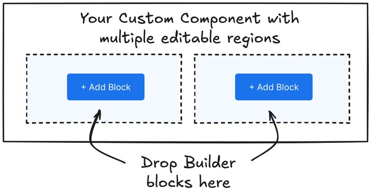
This example shows how to create a layout component with two distinct editable regions. Users can add different content to each column independently in the Visual Editor.
The component uses BuilderBlocks
for each column, which requires these props:
parentElementId
to identify which Builder block owns the contentdataPath
to store each column's content in the correct locationblocks
to manage the actual content for each column
The component registration defines two editable regions using uiBlocks
:
- A left column that can contain any Builder blocks
- A right column that can contain any Builder blocks
Users can drag and drop different Builder components into each column independently, creating flexible two-column layouts.
import {
Builder,
BuilderBlocks,
type BuilderElement
} from '@builder.io/react';
// Define the component
type BuilderProps = {
column1: BuilderElement[];
column2: BuilderElement[];
builderBlock: BuilderElement;
};
const CustomColumns = (props: BuilderProps) => {
return (
<>
<BuilderBlocks
parentElementId={props.builderBlock.id}
dataPath={`column1.blocks`}
blocks={props.column1}
/>
<BuilderBlocks
parentElementId={props.builderBlock.id}
dataPath={`column2.blocks`}
blocks={props.column2}
/>
</>
);
};
// Register with Builder
Builder.registerComponent(CustomColumns, {
name: 'MyColumns',
inputs: [
{
name: 'column1',
type: 'uiBlocks',
defaultValue: {
blocks: [],
},
},
{
name: 'column2',
type: 'uiBlocks',
defaultValue: {
blocks: [],
},
},
],
});
export default CustomColumns;
For more complex use cases, you might need multiple editable regions or slots that can be added dynamically. This tabs example demonstrates how to create a component where users can add new tabs, each with its own editable content area.
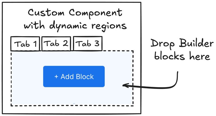
This example shows how to create a tabs component where users can add new tabs dynamically and customize the content of each tab. The component:
- Creates a tab navigation interface where users can switch between tabs
- Provides an editable region within each tab using
BuilderBlocks
- Uses
parentElementId
to connect the blocks to the parent component - Uses
dataPath
to specify where the tab's content is stored - Uses
blocks
to contain the actual content for the active tab
The component registration defines an array input for the tabs, where each tab includes:
- A name field for the tab label
- A blocks field for the tab's content, using the
uiBlocks
type
Users can add new tabs and customize their content directly in the Visual Editor.
import {
Builder,
BuilderBlocks,
type BuilderElement
} from '@builder.io/react';
import { useState } from 'react';
// Define the component
type TabProps = {
tabList: { tabName: string; blocks: React.ReactNode[] }[];
builderBlock: BuilderElement;
};
const CustomTabs = ({ tabList, builderBlock }: TabProps) => {
const [activeTab, setActiveTab] = useState(0);
if (!tabList?.length) return null;
return (
<>
<div className="tab-buttons">
{tabList.map((tab, index) => (
<button
key={index}
className={`tab-button ${activeTab === index ? 'active' : ''}`}
onClick={() => setActiveTab(index)}
>
{tab.tabName}
</button>
))}
</div>
<BuilderBlocks
parentElementId={builderBlock?.id}
dataPath={`tabList.${activeTab}.blocks`}
blocks={tabList[activeTab].blocks}
/>
</>
);
};
// Register with Builder
Builder.registerComponent(CustomTabs, {
name: 'TabFields',
inputs: [
{
name: 'tabList',
type: 'array',
defaultValue: [],
subFields: [
{
name: 'tabName',
type: 'string',
},
{
name: 'blocks',
type: 'uiBlocks',
hideFromUI: true,
defaultValue: [],
},
],
},
],
});
export default CustomTabs;
To customize your components even further, leverage Builder's Input Types.
For more details on child-related options when working with child components, visit the canHaveChildren, childRequirements, and defaultChildren sections of the registerComponent() documentation.
For more examples of custom components with multiple sets of children, visit: