A primary factor in how a block behaves across devices is its width. Builder's blocks already have default width settings, which make them ready to use in responsive layouts.
The following article describes the most common width settings and how they impact block behavior.
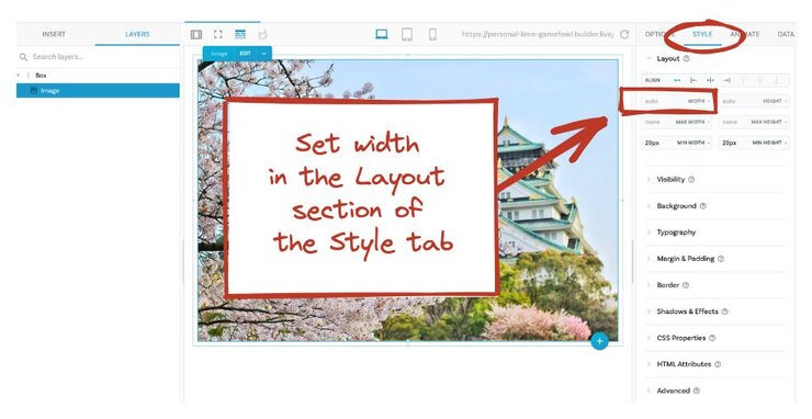
Most frequently used styles, including width, are available as GUI (Graphical User Interface) controls in the Style tab. We recommend that you use the block's default, but if you need to make adjustments, go to the Style tab.
The following image shows the Style tab for an image with a width set to auto.


Since you can build entire responsive layouts with no code in Builder, this article doesn't cover custom CSS. To add or edit custom CSS on a selected element, you can use the CSS Properties section of the Style tab.
Auto width helps blocks respond gracefully to variation in screen size. If a block is behaving in unexpected ways, check that its width setting is auto and then check the width of any block within which it is nested.
In the following screenshot, the Box that the image is in and the image both have a width of auto, which means both are responsive. The auto width takes into account any margins, padding, or border on the image, which keeps the image from overflowing its container.
A block with 100% width makes the block 100% the width of its container, but doesn't include the margin, padding, or border in the calculation. In this case, the block can overflow its container, because the padding and margin are making it too big for the space it's in.
In the following screenshot, the image is overflowing its containing box. To display the elements and their relationships to one another, turn on X-ray mode, which displays bounding boxes, nesting/hierarchy, margin and padding.
In this screenshot, the Box has a pixel width and the image inside the Box has a 100% width and a margin, which causes the image to be too big for the Box. When this configuration repeats over multiple elements on a page, the layout breaks as the screen size shifts.
If you need to use a percentage width for a block, be sure to set its margins, padding, and border to 0. With percentage width, if you still need spacing around the block, put the margin or padding on the containing block that the image is in, not on the block itself. In addition, check to make sure that the containing block doesn't have a fixed width setting, that is a pixel width. Instead, use width auto or 100%.
Use the Section block when you need a section to span the whole screen but you want to limit how wide the content within the Section gets.
Drag and drop a Section block into the work area from the Insert tab. The Section block is unique in that its width is set in vw, or units of viewport width. 100vw, the default Section width, means that the Section spans the entire width of the viewport. The browser window is a common viewport.
While the Section block width is relative to the viewport as long as the width is in the default of vw, the contents of the Section have a maximum width of 1200 pixels by default. This means that you can place other blocks inside the Section block and they won't get bigger than 1200 pixels wide, which is friendly to wide screens.
In preview mode the Section expands to the edges of the browser, while the content stays within its 1200 pixel maximum width.
The following image shows the difference between a Section and a Box. The Section, with its 100 viewport width expands all the way to the edges of the viewport, while the Box is constrained in width by default.
If a block had a width of 50vw, it would be half of the viewport width, regardless of the size. This resembles percentage widths except that the width of vw is relative to the entire viewport, such as the browser window. A percentage width on a block, however, is relative to the parent container, which could be a small part of the viewport. So if you put a viewport width on a block, that block's width is now is calculated based on the viewport size and doesn't reference its parent container.
In the following image, A Section at 100vw is inside of a Box block. The Box block is constrained in width but the Section width does not take into account the width of the Box because the Section width is set in viewport units.
A possible use case for this configuration is if you had a layout where most of the areas of content were constrained but you wanted a section to expand beyond everything else.
Build upon your understanding by reading Margin and Padding, which covers what margin and padding are, how they affect block width, and when to use them.


