When a design shifts gracefully from one screen width to another, the design is responsive. A key element in building responsively is using points at which the layout changes to maintain its design integrity. These points, referred to as breakpoints in web development, are viewport widths that commonly include certain device types.
For example, in the following video the Visual Editor uses breakpoints to determine which viewport widths includes small devices, such as phones, medium devices, such as tablets, and larger screens such as monitors and on laptops.
Builder has three built-in breakpoints for planning your layouts:
- Phone: 0-639px
- Tablet: 640px-991px
- Desktop: 992px+
These pixel widths include most of the devices in each category and Builder applies these breakpoints automatically in the Visual Editor.
To make style changes for specific widths, click on the icon for that width and edit the styles. Any time you make changes to a width, those styles apply to that width and smaller. For example, if you make style changes to the tablet view, those changes apply to tablet and phone widths. If you make style changes in phone view, those changes apply only to phones.

Tip: To customize your breakpoints, see Customizable Breakpoints.
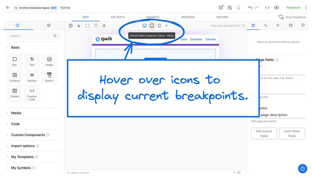
In the Visual Editor, hover over the Desktop, Tablet, or Phone icon to display the breakpoints that currently apply to that view.
The image below shows the hover state of the tablet icon with a default breakpoint of 641px to 991px:

For information on viewing custom breakpoints, refer to the Viewing custom breakpoints section of the Using Custom Breakpoints documentation.
When creating Pages and Sections in the Visual Editor, you can preview and edit your work for desktop, tablet, and phone.
- Click on the device icon you'd like to preview at the top center of the Visual Editor work area.
- Make edits as needed. For example, if a heading font size is too large only on phone, reduce the font size while displaying the phone viewport width.
- Publish so your updates take effect on your live site.

Tip: When you change styles on a screen size, the change applies that screen width and smaller, but do not affect the larger screen sizes. In this way, you can fine-tune the styles for smaller devices without changing styles for wider screens.
In the following video, the font size is changed at the Phone and Tablet widths. Then the different widths are displayed to show that smaller-screen styles apply at those widths only.
The Mobile Sidecar Preview helps you keep the mobile experience in mind when working in the default Desktop view.
To open Mobile Sidecar Preview:
- Click Change layout editor icon.
- Select Mobile Sidecar Preview.
- Continue working in the Visual Editor as usual. When you click on an element, the phone preview scrolls to the selected element.
- To make changes in Phone view, follow the instructions in the previous section, Editing content at different breakpoints.
To close Mobile Sidecar Preview:
- Click Change layout editor icon.
- Select Auto, Always Two Column, or Always Three Column.
The following video shows opening, working in the Visual Editor, and closing the Mobile Sidecar preview.
Refine your use of breakpoints with a solid foundation in responsive techniques. For more information, see:


