Builder's input types define the editing interface for fields in both custom components and data models. This document covers all available input types and their configuration options, including:
- Required inputs: inputs you must use with your custom components
- Optional inputs for further customization: inputs that you can use to modify the look and behavior of your component in the Visual Editor
- Input type examples: definitions, code snippets, and a screenshot of input types in the Visual Editor
These input types can be used in two main contexts:
- Custom components: When registering components with
Builder.registerComponent() - Data models: When creating custom fields for your content models
Most input types work identically in both contexts, though some features like showIf and onChange are specific to data models, and the model input type is only available for data models.

Tip: With plugins in Builder, you can create custom field types. For more information on using Builder's built-in plugins or creating your own, see Intro to Built-in Plugins and Make a Plugin.
To get the most out of this document, you should be familiar with Integrating Your Custom Components with Builder.
When you register a component with Builder, you must include the name and type inputs as in the following table:
| Name | Description |
|---|---|
| A unique name for this input that should match the equivalent prop name on your React component. |
| Types correlate to what editing UI is appropriate to edit this field. Common types include: |
You can use additional inputs to further customize your components in Builder. The following table contains Builder's optional inputs.
| Name | Type | Description |
|---|---|---|
| Set to | |
| For the | |
| Use for showing an example value in the input form when creating a new instance of this component, to users understand its purpose. | |
| For any text-based field type, you can specify a set of options that the field can use. Instead of a string, pass an object to customize the displayed label and internal value. This is useful if you are using code to modify state within your content entry. | |
| The name the Visual Editor displays for the input. | |
| Provide text to help the end user know how to fill in this input. Displays below the input. | |
| Use optionally with inputs of type | |
| Provide a function that is called whenever the value of the input is updated. Useful for more complex validation than | |
| For any input that results in a string value you can provide a regex to validate user input. | |
| Show and hide the input dynamically.
For example, to only show the input if the component is inside of a Use the state of other inputs with For versions of In versions | |
| If the input type is | |
| You can mark any input type with |
This section provides examples of the effects of input types in Builder and covers the following:
- Input type name
- Definition of input type
- Alias/alternative input type you can use instead of the given input type
- Screenshot of input type's effect in Builder's Visual Editor

Tip: This section covers the built-in types for custom components, but you can also make your own with plugins. For more information, see Make Your Own Plugins Overview.
An input field taking true or false.
{
name: 'darkMode',
type: 'boolean',
defaultValue: true,
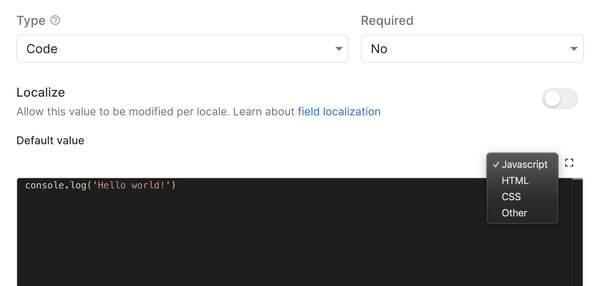
}A code editor with syntax highlighting and language selection. Supports multiple programming languages including JavaScript, CSS, HTML, and others.
{
name: 'customScript',
type: 'code',
defaultValue: 'console.log("Hello World");'
}
Provides a color value, in hex or rgb, to a component.
{
name: 'backgroundColor',
type: 'color',
defaultValue: '#fafafafa',
}Takes same formats as the date constructor for Javascript.
{
name: 'event',
type: 'date',
defaultValue: 'December 17, 1995 03:24:00',
}Creates an email value for a component.
{
name: 'signup',
type: 'email',
defaultValue: 'noreply@email.com'
}enum
Creates a dropdown of the given values. The label is what is shown during option selection while the value is what can be accessed within code upon selection.
{
type: "enum",
name: "sortBy",
enum: [
{
label: "Date of Creation",
value: "CREATED_AT",
},
{
label: "Location ID",
value: "ID",
},
{
label: "Popularity",
value: "POPULARITY",
},
],
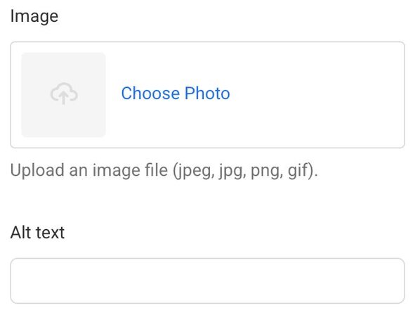
}Uploads a file to the Asset Library and returns the value as a URL string. Refer to allowedFileTypes for details.
{
name: 'image',
type: 'file',
allowedFileTypes: ['jpeg', 'png']
}If the uploaded file includes alt text in the Asset Library, Builder provides an altText prop to the custom component without requiring manual configuration.
To override the default alt text, register a separate input, as shown in the example:
{
name: 'image',
type: 'file',
allowedFileTypes: ['jpeg','gif'],
},
/* Define altText manually */
{
name: 'altText',
type: 'string',
}
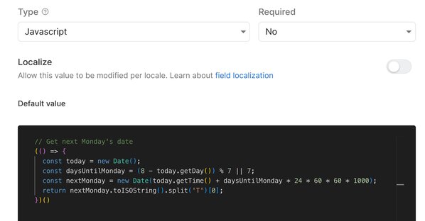
Custom JavaScript code snippets with syntax highlighting optimized for JavaScript.
{
name: 'eventHandler',
type: 'javascript',
defaultValue: 'function handleClick() { /* your code */ }'
}
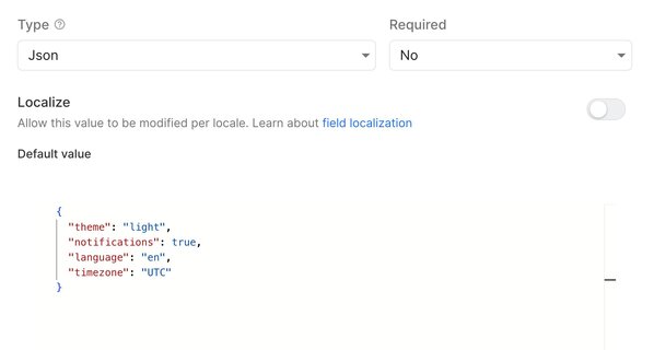
Free-form JSON input with validation and syntax highlighting.
{
name: 'config',
type: 'json',
defaultValue: '{"theme": "dark", "enabled": true}'
}
A collection of items.
Requires the defaultValue option.
Alias: array
{
      name: 'reviews',
      type: 'list',
      defaultValue: [
            { reviewText: 'hello'
     }],
      subFields: [
	{
          name: 'reviewText',
          type: 'string',
          defaultValue: '"You are
          the best"',
        },
        {
          name: 'reviewAuthor',
          type: 'string',
          defaultValue: 'Jane Smith',
        },
        {
          name: 'image',
          type: 'file',
          allowedFileTypes: ['jpeg', 'jpg', 'png', 'svg'],
          required: true,
          defaultValue:
         'https://cdn.builder.io/api/v1/image/assets%2Fpwgjf0RoYWbdnJSbpBAjXNRMe9F2%2Ffb27a7c790324294af8be1c35fe30f4d',
        },
      ],
}A localized text input is a key/value object where the keys are the locales configured in your space. For more information, see Introduction to Localization with Builder.
{
  name: 'title',
  type: 'text',
  localized: true,
}Same as string type but with a multi-line text field editor.
  {
    name: 'description',
    type: 'longText',
    defaultValue: 'Builder is the first and only headless CMS with a powerful
    drag-and-drop visual editor that lets you build,
    optimize, and measure digital experiences with speed and flexibility'
  }
Tip: If the text is to be formatted, use richText.
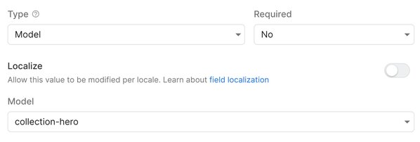
Gets fields from another data model and stores the data at the content level, rather than creating a reference.
Unlike the reference type, which links to another content entry, the model type copies the structure from another model to store data locally within the current content entry.
This input type is primarily used in Data models rather than custom components.
{
  name: 'authorInfo',
  type: 'model',
  model: 'author', // References the 'author' data model
}
Specifies that an input field expects a number.
  {
    name: 'amount',
    type: 'number',
    defaultValue: 20,
}A set of specific names and values.
object requires the defaultValue option. Additionally, if you want to specify default values, make sure you provide them at the object level, not in the subFields.
  {
      name: 'Carousel',
      type: 'object',
      defaultValue: {
        // Provide default value here,
        // NOT in the subFields
         text: 'This is the default text input',
         url: 'http://www.myexampleurl',
         variant: 'primary'
      },
      subFields: [
        {
          name: 'text',
          type: 'string',
          required: true,
        },
        {
          name: 'url',
          type: 'url',
          required: true,
        },
        {
          name: 'variant',
          type: 'string',
          enum: ['primary', 'info', 'dark', 'light', 'warning'],
        },
      ],
    }
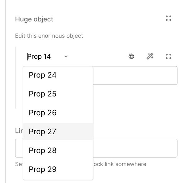
If you have large objects with multiple fields:
- Use
foldedso that multiple inputs are collapsed by default to preserve space on the screen. - Use
keysHelperTextto provide helpful copy to the user.
    {
      name: 'HugeObject',
      type: 'object',
      folded: true,
      keysHelperText: 'Pick a property to edit',
      helperText: 'Edit this enormous object',
      subFields: [
        ... /* Lots of subFields here */
      ]
    },
Displays a rich text editor and provides the value as HTML
Alias: html
  {
    name: 'description',
    type: 'richText',
    defaultValue: '<b>This text is bold</b>'
}Any text, usually short in length and unformatted.
Alias: text
  {
    name: 'buttonText',
    type: 'string',
    defaultValue: 'Click',
}Tags, usually short text for adding tags to your content entries.
  {
    name: 'blogTags',
    type: 'Tags'
}A valid URL. URLs must be absolute (start with http:, https:, mailto:, sms:, or tel: and have a hostname) or site relative (/page/name) or a hash (#something).
  {
    name: 'myUrl',
    type: 'url',
    defaultValue: 'https://builder.io',
}While most input types work identically in both custom components and data models, some types and features are specific to data model usage.
model: Available only in data models for embedding another model's structurereference: Creates relationships between different content entries
Data model inputs support additional configuration options:
Control when fields appear based on other field values:
{
  name: 'advancedOptions',
  type: 'object',
  showIf: function(options) {
    return options.get('enableAdvanced') === true;
  },
  subFields: [...]
}Important: showIf hides fields in the UI but doesn't remove their values from the content. Fields hidden by showIf will still return their values in API responses.
Execute custom logic when field values change:
{
  name: 'quantity',
  type: 'number',
  onChange: function(options) {
    const value = options.get('quantity');
    if (value > 100) {
      // Handle edge case
    }
  }
}If you have a design system that features an icon set, you can use a custom component that takes an icon name as input. In this way, you can manage and distribute your icons across your app. Register your icon component as below:
 Builder.registerComponent(Icon, {
    name: 'Icon',
    inputs: [{ name: 'icon', type: 'text', enum: ['error', 'warning' ..] }]
},Every use case is unique. If you need further customization, you can add custom types with plugins.


