By providing your own Design tokens, you can define a consistent set of design values that are available to your users in the Builder Visual Editor.
- Use design tokens to dictate specific values for CSS properties.
- Optionally allow users to override tokens, so that the tokens are suggestions rather than required values.
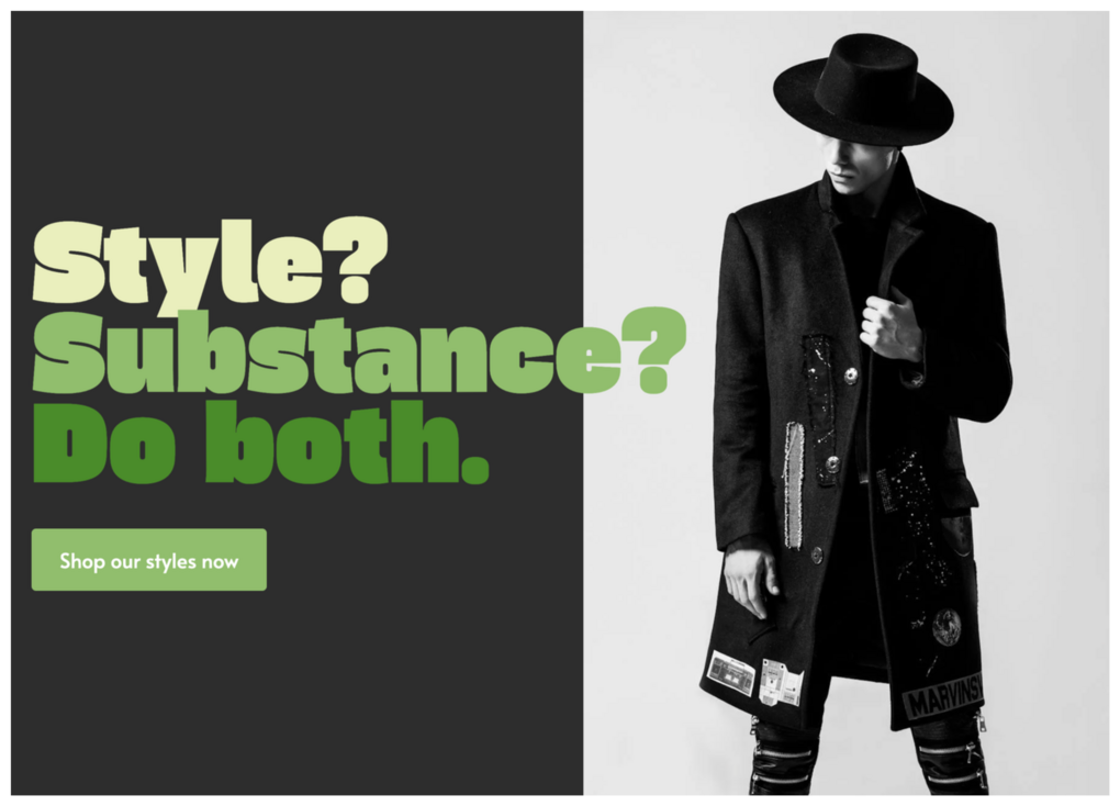
This tutorial results in a basic callout with text colors, fonts, spacing, and sizes aligned with a project's codebase.

To complete this tutorial, you need:
- An integrated Page or Section and access to your codebase.
- A two-column, full-width section with text on one side and an Image block on the other.
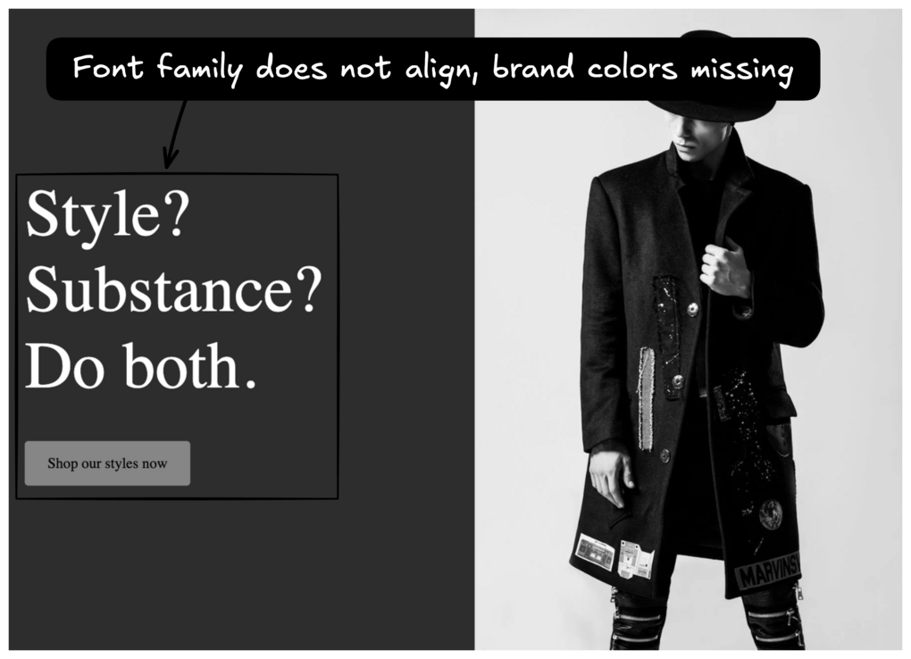
Begin by identifying what elements in your current design are out of sync with your brand's design aesthetic. Doing so makes it clearer which design tokens you should create.
Instead of guessing colors, font families, or even font sizes, use design tokens to lock in the correct values.
In the following image, the font family is out of sync with the brand's design. Brand colors are also missing from the design.

Add the following code to your integrated page to register a design token. This design token will define a new value, Primary, for text colors.
Instead of inputting the direct value, use CSS variables for more modular code. For example, first define a CSS variable and value within your CSS file.
:root {
  --color-primary: #90be6d;
}
Then, replace the value within the "editor.settings" object.
{
  designTokens: {
    colors: [
      { name: "Primary", value: "var(--color-primary)" }
    ],
  }
}Once your design token is registered, select it within the Visual Editor.
In this example, select a Text block and choose the text's Color option. An option named Primary, which is defined in the settings object, is now available. Upon selection, the color of the text changes.
Continue to add design tokens to your application as needed. The object's keys should be CSS properties in camel case. Each property should have a value of an array of one or more design tokens.
A robust example object is included below.
{
  designTokens: {
    colors: [
      { name: "Black", value: "#000000" },
      { name: "White", value: "#FFFFFF" },
      { name: "Primary", value: "var(--color-primary)" },
      { name: "Primary Light", value: "var(--color-primary-light)" },
      { name: "Primary Dark", value: "var(--color-primary-dark)" },
      { name: "Secondary", value: "var(--color-secondary)" },
      { name: "Secondary Light", value: "var(--color-secondary-light)" },
      { name: "Secondary Dark", value: "var(--color-secondary-dark)" },
    ],
    fontFamily: [
      { name: "Primary Font", value: "var(--font-family-base)" },
      { name: "Callout Font", value: "var(--font-family-callout)" },
    ],
    fontSize: [
      { name: "Base Font Size", value: "var(--font-size-base)" },
      { name: "Large Font Size", value: "var(--font-size-large)" },
      { name: "Small Font Size", value: "var(--font-size-small)" },
      { name: "Callout Font Size", value: "var(--font-size-callout)" },
    ],
  }
}For more details on design tokens, including optional values to include in the settings object, visit Design tokens.


