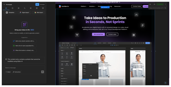
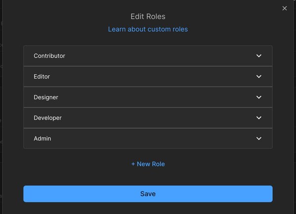
This document differentiates between the two main Builder products—Projects and Publish—and recommends learning paths based on your role in those products.
Builder offers two complementary products to accelerate your team's workflow:
Projects connects directly to your codebase, so you can visually build features with AI that understands your components and coding conventions.
Use Projects for:
- Building features or applications within an existing codebase
- Developing UI with AI assistance
- Working with designers to convert Figma designs to production code
- Building prototypes or MVPs with your design system
Publish empowers marketing and content teams to create and manage content independently to reduce dependencies on engineering.
Use Publish for:
- Launching content quickly, even if you're not a developer
- Enabling non-technical teams to self-serve web content
- Managing structured content across multiple channels
- Running A/B tests and personalization campaigns
Depending on whether you're using Projects or Publish, the workflow follows one of these general outlines.
To get going with Builder Projects:
For a guide through the main workflow, see Get started with Projects.
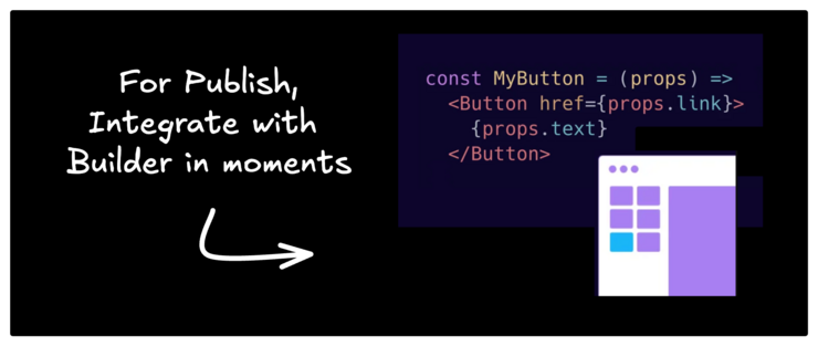
To get going with Builder Publish:
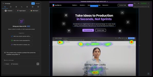
- Import your design from Figma or from the web.
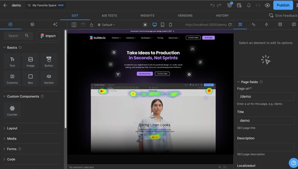
- Iterate with the Builder Visual Editor AI.
- Integrate Page building.
- Integrate custom components.
For a guide through the main workflow, see Get started with Publish.
Your specific path will also depend on your role—whether you're building features, managing content, or designing experiences.
Learn your way around Builder based on your role. The Builder documentation has articles that cover the basics to get you started and help you go in-depth. The following categories are based on Builder Roles and permissions, so find your role and dive into the recommended documentation for that role.
If you're just starting out with Builder, read Key Concepts first for context on how Builder works and an intro to common terms.
Because Contributors don't edit layouts, they can focus on content such as copy and images. To get familiar with Builder, get up and running with our recommended learning path:
Recommended docs:
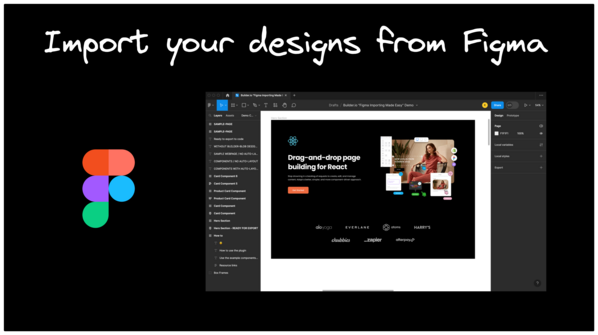
To get off to a good start, Designers should get acquainted with importing from Figma, Builder's features made just for Designers, and how to apply the principles of responsive design in the Visual Editor.
Recommended docs:
- Get started with Publish or Get started with Fusion depending on your plan
- Builder Figma Plugin
- Figma export modes
- Figma to Publish Workflow for Publish plans
If you're an Admin, you might have many varied responsibilities, while still maintaining access and permissions in Builder for your team. If you need to create web experiences, make sure to read the documents under Designer, in the previous section.
To get started with Publish, visit Publish with Builder, which highlights some of the most frequently used documentation tailor-made for developers.
