Position blocks within containers using alignment options in the Visual Editor's Layout section. Control horizontal and vertical placement to create responsive layouts.
For more information about blocks, see Block Types.
Familiarize yourself with these concepts before working with alignment:
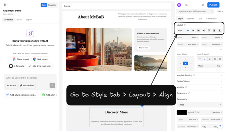
Find alignment controls in the Style tab of the Visual Editor. The Layout section contains the Align row with the following options:
- Fill width: expands the block to fill the container's width.
- Align to the left side: positions the block on the left.
- Center horizontally: centers the block horizontally.
- Align to the right side: positions the block on the right.
- Align to the top side: positions the block at the top.
- Center vertically: centers the block vertically.
- Align to the bottom side: positions the block at the bottom.
The screenshot below shows the location of alignment controls in the Visual Editor within the Style tab's Layout section:

Choose horizontal alignment based on layout needs. Select the child block to align, not the parent container.
Click Fill width to make blocks span the container's full width. This creates responsive blocks that automatically adapt to different screen sizes and helps with consistent layout behavior across devices.
When to use: Content that should expand across the full container width, such as hero sections or full-width images.
Click Align to the left side to position blocks on the left side of the container.
When to use: Text content, navigation elements, or content that follows left-to-right reading patterns.
Click Center horizontally to position blocks in the horizontal center of the container. Blocks automatically adjust width to fit the content unless width constraints are specified.
When to use: Headings, buttons, or featured content that should draw central focus.
Click Align to the right side to position blocks on the right side of the container.
When to use: Secondary information, metadata, or content that supports left-aligned primary content.
Note: For blocks that appear full-width despite alignment settings, add width constraints. See How Width Affects Layout for configuration details.
The next video shows horizontal alignment options in action:
Vertical alignment requires the parent container to have sufficient height. Set Min Height on parent containers as needed.
Click Align to the top side to position blocks at the top of the container.
When to use: Headers, navigation, or content that should appear first in the visual hierarchy.
Click Center vertically to position blocks in the vertical center of the container.
When to use: Call-to-action buttons, hero text, or content that should be visually balanced.
Click Align to the bottom side to position blocks at the bottom of the container.
When to use: Footnotes, disclaimers, or secondary actions that should appear last.
The next video shows vertical alignment and the importance of container height:
Place blocks inside container elements like Box blocks to control alignment context. Containers define the boundaries within which alignment operates.
Best practice: Nest blocks inside Box containers rather than aligning them relative to the entire page. This approach provides predictable alignment behavior and maintains layout organization across different screen sizes.
Example structure:
- Create a Box container.
- Add Image or Text blocks inside the Box.
- Apply alignment to the nested blocks.
- The Layers panel shows this hierarchy clearly.
This structure keeps layouts organized and ensures alignment behaves consistently across devices.
For complex layouts, Builder provides additional alignment options when containers have child elements.
Inner Align provides a 3x3 grid for visual positioning within containers. The blue square shows the current alignment position. Use this for precise positioning when standard alignment options are insufficient.
This next video shows using the Inner Align grid for precise positioning:
Inner Layout controls how multiple child elements arrange within containers:
- Horizontal Layout: arranges elements side by side.
- Vertical Layout: stacks elements vertically
- Wrap: Allows elements to wrap to new lines on smaller screens.
- Horizontal Scroll: creates scrollable rows of content.
- Convert to Columns: transforms layouts into responsive column structures.
Choose Inner Layout options based on content organization needs and responsive requirements.
The next video shows the different Inner Layout options for organizing multiple elements:
Alignment choices affect how layouts adapt to different screen sizes.
Test alignment across device types using the responsive preview options. Content centered on a desktop may need left alignment on mobile for better readability.
Alignment works with container spacing and width settings. See Margin and Padding and How Width Affects Layout for more details.
Build on layout skills by exploring related topics:


