When importing your design from Figma, preparing your design file can save you time and work because you're letting the AI know your intentions so it can better handle the import process.
If you're using Easy Mode to import, you don't need to use Auto Layout — though you can and it always helps. However, if you're using Precise Mode, you must use Auto Layout to prepare your design. For more detail, read Figma export modes.
Takeaways
When using Precise Mode:
- Always apply Auto Layout to your Figma file.
- Always explicitly define images.
When setting up your Figma design for importing with Precise Mode, you must:
When preparing your file, remember this checklist:

These two steps give you a way to specify your intention for every aspect of your design.
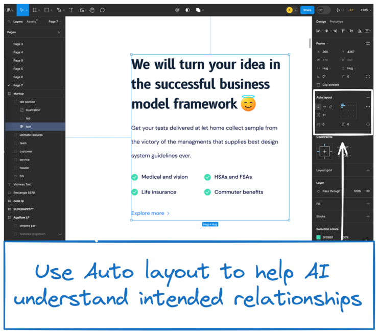
Use Auto Layout to organize elements into responsive hierarchies. Auto Layout aids in encouraging the correct behavior of the AI model, particularly in complex designs.
Converting your design to use Auto Layout is the best way to ensure it imports well. To make this conversion easier, try Figma's new suggest Auto Layout feature.
The image below shows where to find Figma Auto Layout. If it's not there, search the help menu for Auto Layout and select Add Auto Layout.
For complex designs featuring lots of visual elements, it's important to help the AI model recognize them as a single image. Use the export feature to define an export for an element explicitly. This guides the AI in identifying it as an image with certainty.
Select the element and expand the Export section by clicking the plus button next to Export as in the video below.
A well-organized layout helps the AI understand your design's structure and hierarchy. This section covers more in-depth tips for organization when using Auto Layout, but if you've followed the 2-step checklist at the beginning of this document, your file should be prepared.
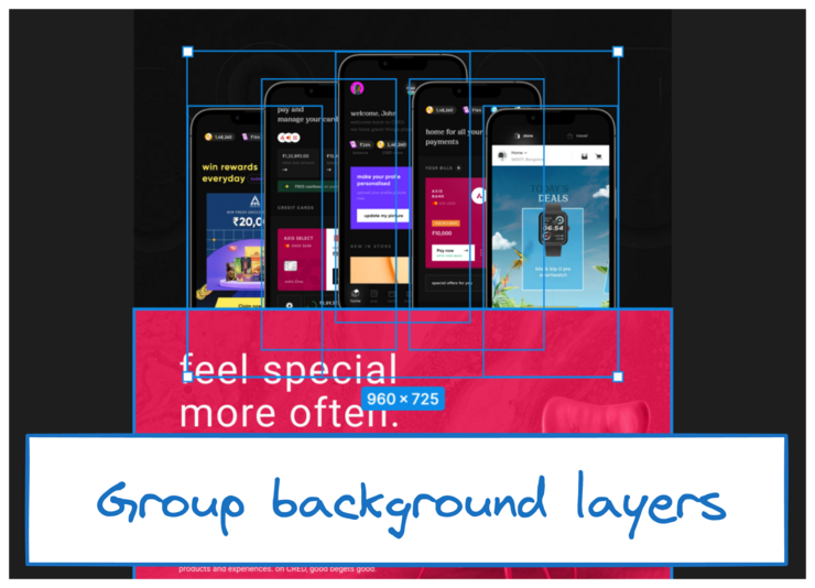
Group layers that constitute background elements together. Creating a dedicated group for background elements simplifies the structure and enhances the output when exporting as an image.
The image below shows an example of multiple background layers that can be grouped.
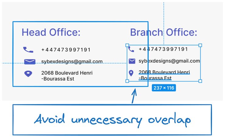
When overlapping elements, align boxes only with related components. If layers don't need to overlap, position their selection boxes so that they don't overlap or touch.
Additionally, minimize intersections between elements, as intersections can lead to undesirable results. If challenges persist regarding overlapping or intersecting elements, consider grouping them together, similar to a background.
The next image shows two text boxes that are overlapping when they could instead be closer to their contents without changing the layout.
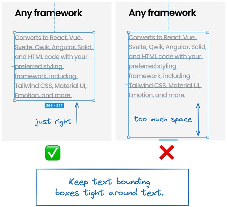
Keep text bounding boxes snug to the text within them, rather than much larger than the text. Excessive space in the bounding box can lead to issues in the output, including extra whitespace and line breaks within text layers.
The image below shows two text boxes; one has the boundaries snugly fit to the content, which is the preferred technique. The other, image shows a text box that is way too big, which can be challenging for AI.
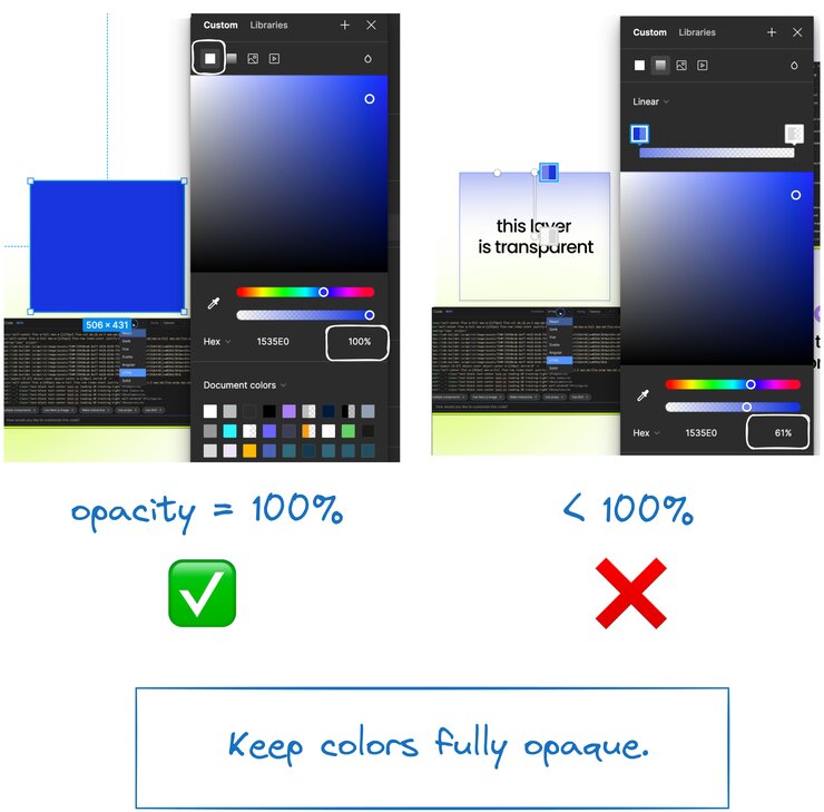
Transparency effects, such as translucency or opacity, can pose challenges in the interpretation of the design. It's advisable to avoid using translucent effects, as they may not be well-supported and can result in unexpected outcomes.
The image below shows a layer with 100% opacity and a layer with transparency applied in a gradient. Transparency in any form can be tricky for AI to understand, so, if possible, we recommend sticking to fully opaque colors.
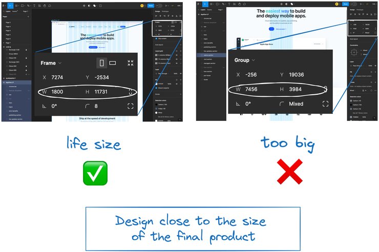
Design elements to closely match real-world dimensions for accurate and practical results. Use a scale that aligns with the intended output size.
Extreme scaling may necessitate adjustments that impact the overall design. If your design has a large scale, consider addressing it within the Figma plugin or communicating with developers for optimal results.
The next image shows a page design (left) that is designed close to the final size of the finished product as well as a page that is much larger than the final product will end up. Be sure to provide the plugin with the size you'd like your design to be when it's finished.
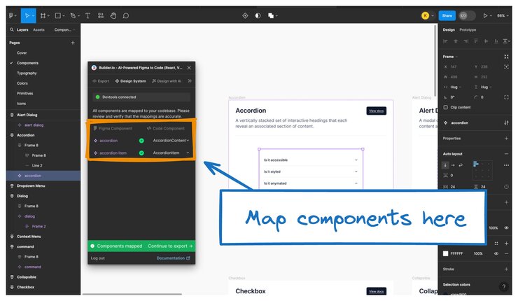
When using the Builder Figma plugin, leverage component mapping to establish a direct link between your Figma design components and their corresponding code components. By mapping your Figma components to the codebase, you optimize the development process, reduce discrepancies, and maintain design integrity.
By default, the plugin attempts to figure out which Figma designs correspond to which code components, but checking the mappings and making edits as needed increase accuracy.
The image below shows where in the Builder Figma plugin to map components. On the left are the Figma components and on the right, the detected code components. Note that you must be running Devtools to map components.
For more detail, visit Map Figma Components.
In addition to the written content in this document, the video below covers best practices when preparing your Figma file for importing into Builder.
For more information on previewing your content once it's in Builder, visit Set up a Preview URL for Figma Imports.


