Skip to content
Skip to main contentIntroducing Agent-Native, the framework for agentic apps.Read the announcement
CONTACT SALESSTART BUILDING

Builder Content overview

Get started

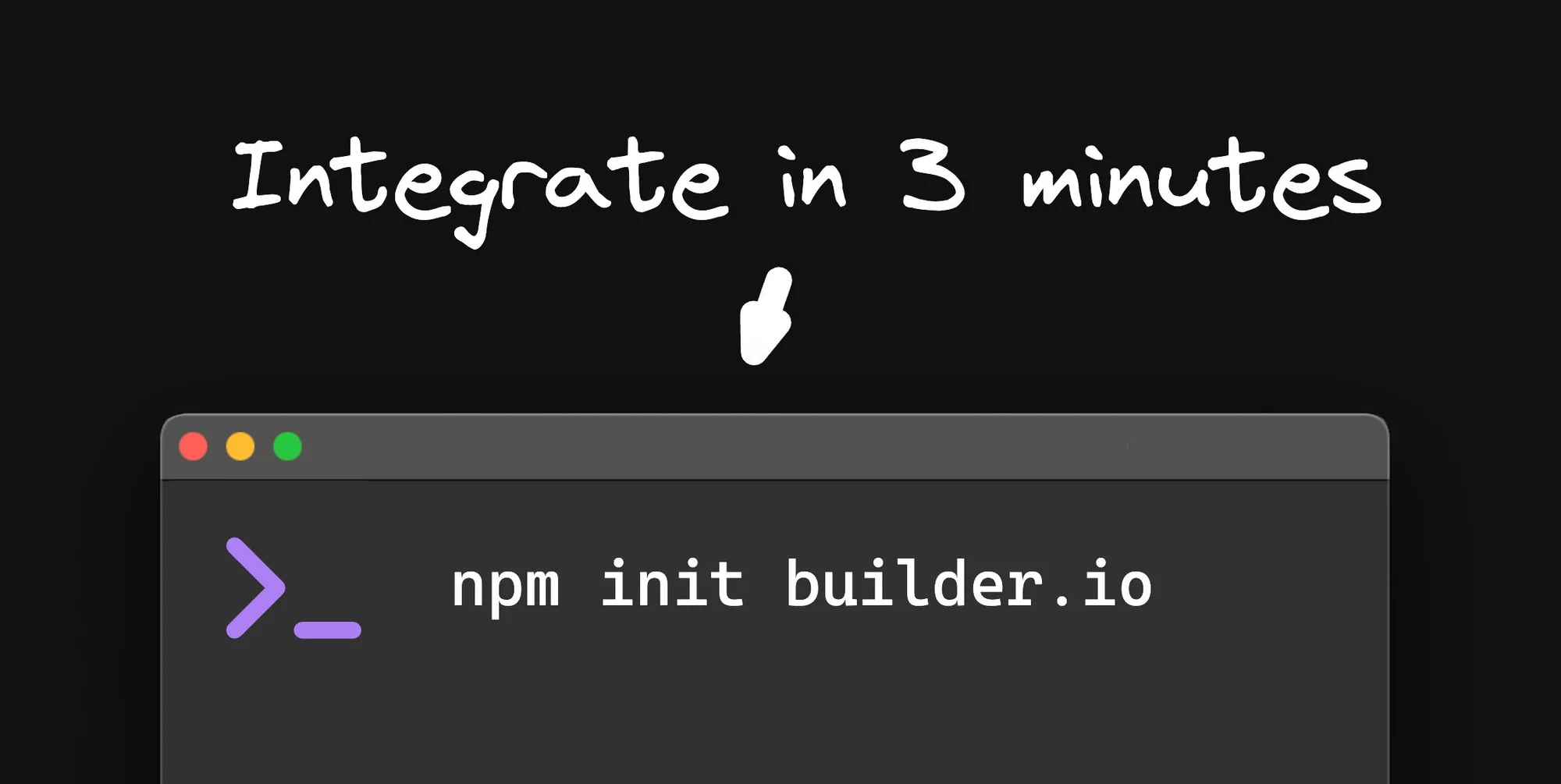
Integrate in 3 minutes

Publish Quickstart

Integrate with your code

Which should I use?

Dive deeper

A light design frame on the left, headed by blue, purple, and green window dots and filled with colorful design blocks, transforms via a bold cyan arrow into a cyan-tinted Builder content panel on the right with a blue border, marked with a green check badge to show the design has been imported and is ready.

Import from Figma

A light model blueprint card with blue, purple, and green typed field rows branches outward into a cascading stack of content entries; the front entry is active with a blue border and a green published-check badge, showing that many entries are generated from one model.

Learn About Content Models

A light token library lists three token types — a row of blue, purple, and green color swatches, a purple type ramp, and a green spacing measure — each joined by a matching-colored line to where it lands on a Builder page: cyan on the hero, purple on the heading, and green on the spacing between sections.

Integrate Design Tokens

A light card showing a cyan code glyph above a rendered purple-and-green component preview connects through a plus-shaped add badge into a Builder component library grid, where the newly registered custom block is highlighted with a blue border and a green check while the other blocks stay neutral.

Integrate Custom Components

Popular developer docs

A central Builder core panel is linked by bold cyan connectors to three colored plugin modules — purple, green, and orange — and one dashed empty slot with a plus, showing Builder extended by plugins.

Extend Builder with Plugins

Was this article helpful?