You know those parallax scrolling effects where background images move at different speeds as you scroll? They create depth and make websites memorable. But most tutorials overcomplicate them.
Here's what might surprise you: you don't need a third-party library. No , no 30kb of dependencies. No Lenis. No GSAP. No Three.js. Not even WebGL. Just vanilla JavaScript, some refs, and a scroll listener.
I'll show you a straightforward approach that works best in 2026. Then I’ll show you how to implement that in a fraction of the time using AI.
Parallax scrolling is a technique where background images move slower than foreground content as you scroll, creating an illusion of depth.
At its core, it has three components:
- Multiple visual layers stacked on top of each other
- Each layer moves at a different speed
- Movement is tied to scroll position
When done right, it creates depth. When done incorrectly, it can cause motion sickness or poor performance. The key is smoothness and subtlety.
The key is thinking like an animator. You are creating distinct layers of imagery.
Here's where it gets fun. Instead of finding stock images, I generated custom layers in Midjourney specifically designed to composite together.
For my space theme, I made three distinct layers with transparent backgrounds:

Background layer: Celestial gases and nebulae - deep purples, pinks, and cosmic clouds with stars scattered throughout. This provides atmosphere and sets the mood.

Midground layer: A large purple planet - detailed surface with craters and atmospheric glow. This is your focal point that draws the eye.

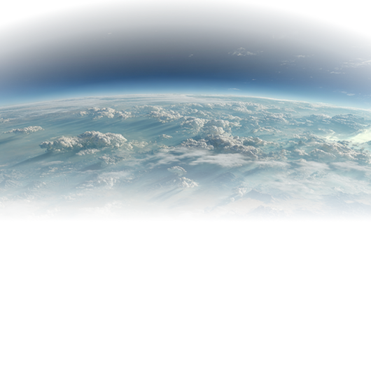
Foreground layer: The cresting sphere of another planet - just the top curve visible, like it's rising into view. This creates depth by partially obscuring the scene behind it.
The secret is using transparent backgrounds (PNG with alpha channel) so the layers blend naturally when stacked. In Midjourney, I used prompts like:
celestial nebula gases in purple and pink, cosmic clouds, scattered stars,
cinematic lighting, transparent background, isolated on black --ar 16:9 --v 6
large purple planet with detailed surface, craters, atmospheric glow,
space photography style, transparent background, isolated --ar 1:1 --v 6cresting curve of a planet sphere, top third only, Earth-like with clouds,
view from space, transparent background, isolated --ar 16:9 --v 6Parallax makes websites memorable. In a sea of flat pages, subtle motion creates depth and emotional engagement.
Use it for:
- Hero sections that need strong first impressions
- Storytelling pages that guide users through a narrative
- Portfolio sites showcasing visual design skills
Modern browsers run transforms on the compositor thread, so parallax is smooth even on mobile. When done right, it's one of the smoothest effects you can add.
Skip it when:
- Your site is content-heavy and users need to scan quickly
- You can't properly support reduced motion preferences
- You're on a tight deadline
The best parallax is subtle. If users feel the smoothness but can't explain why, you nailed it.
Parable VC uses three crisp layers (sky, cityscape, clouds) with subtle speed differences. Polished without being distracting.
Firewatch's website uses parallax mountain layers that mimic the game's aesthetic.
What do these have in common? Parallax supports the story, but doesn’t replace. The effect enhances content rather than being the content.
After testing multiple methods, the clear winner is direct scroll with transform. It's what I recommend for most projects.
This method is completely library-free. No dependencies beyond React. Just a scroll listener and some transforms. Here’s how you create a library-free parallax effect:
First, we set up our layers with fixed positioning and refs to manipulate them.
const backImageRef = useRef<HTMLImageElement>(null);
const midImageRef = useRef<HTMLImageElement>(null);
const frontImageRef = useRef<HTMLImageElement>(null);

return (
  <div className="fixed inset-0 w-full h-full overflow-hidden">
    {/* Back layer - celestial gases and nebulae */}
    <img
      ref={backImageRef}
      src="<https://cdn.builder.io/api/v1/image/assets%2F...%2F95b922f380c94928900347b8088b0c4f>"
      alt=""
      className="absolute inset-0 w-full h-full object-cover"
      style={{ willChange: "transform" }}
    />

    {/* Middle layer - large purple planet */}
    <img
      ref={midImageRef}
      src="<https://cdn.builder.io/api/v1/image/assets%2F...%2F1f33aa1dbcdf4d20afa9b5c701d110ef>"
      alt=""
      className="absolute object-contain"
      style={{
        willChange: "transform",
        left: "calc(15% - 250px)",
        top: "calc(15% + 200px)",
        width: "70%",
        height: "70%",
      }}
    />

    {/* Front layer - cresting planet sphere */}
    <img
      ref={frontImageRef}
      src="<https://cdn.builder.io/api/v1/image/assets%2F...%2Fe495996c1879406cbd308e74b0c93814>"
      alt=""
      className="absolute w-full h-full object-cover"
      style={{
        willChange: "transform",
        objectPosition: "center top",
        top: "-20%",
        transform: window.innerWidth < 768 ? "translateY(680px)" : "translateY(820px)",
      }}
    />
  </div>
);
What this is doing:
fixedpositioning keeps the parallax container pinned to the viewport while content scrolls over it- Each layer gets its own ref so we can transform it independently on scroll
willChange: transformtells the browser to optimize these elements for transformation- The front layer starts with a large offset so it enters the viewport as you scroll down
- Mobile gets a different offset (680px vs 820px) because the viewport is smaller
Now we attach a scroll listener that moves each layer at a different rate.
useEffect(() => {
  const handleScroll = () => {
    const currentScrollY = window.scrollY;

    if (backImageRef.current) {
      backImageRef.current.style.transform = `translateY(${-currentScrollY * 0.3}px)`;
    }

    if (midImageRef.current) {
      midImageRef.current.style.transform = `translateY(${-currentScrollY * 0.4}px)`;
    }

    if (frontImageRef.current) {
      const baseOffsetMobile = 680;
      const baseOffsetDesktop = 820;
      const isMobile = window.innerWidth < 768;
      const baseOffset = isMobile ? baseOffsetMobile : baseOffsetDesktop;
      frontImageRef.current.style.transform = `translateY(${baseOffset - currentScrollY * 0.5}px)`;
    }
  };

  window.addEventListener("scroll", handleScroll, { passive: true });
  return () => window.removeEventListener("scroll", handleScroll);
}, []);
What this is doing:
window.scrollYgives us the current scroll position in pixels- Each layer multiplies scroll by a different speed: 0.3x, 0.4x, 0.5x
- Negative values for back and mid layers move them up as you scroll down, creating the parallax lag
- The front layer subtracts scroll from its base offset, so it enters the viewport
passive: truetells the browser we won't callpreventDefault(), enabling scroll optimizations- Cleanup removes the listener on unmount
This approach is simple, direct, and performant. On every scroll event, we read the scroll position once and update three transforms. That's it. No calculations, no state updates, no re-renders. Just direct DOM manipulation.
The browser can optimize transform operations because they run on the compositor thread. This means smooth 60fps scrolling even on slower devices.
While direct scroll with transform is the best all-around choice, here are three alternatives:
Add lerp (linear interpolation) to make layers ease into position instead of snapping. Creates buttery smooth motion but uses more CPU and adds slight input lag. Good for high-end sites where ultra-smooth is the goal. Overkill for most projects.
Use animation-timeline: scroll(root) to tie animations to scroll position. Zero JavaScript, runs entirely on the browser’s compositor thread. The future of parallax, but browser support is limited (no Firefox yet as of 2026). Less flexible for responsive behavior.
Only runs parallax when the section is visible. Calculates scroll progress relative to the section, not the whole page. Great for multiple parallax sections throughout a long page. Overkill for hero sections that are always visible on load.
Bottom line: Stick with Method 1 (direct scroll with transform) unless you have a specific reason to try something else. It's simple, works everywhere, and performs well.
Here's the shortcut: instead of hand-coding scroll listeners and transform math, use Fusion to generate the entire implementation.
With Fusion you describe what you want, and it writes production-ready code. For parallax, this means you can iterate visually without touching JavaScript.
The key is being specific about speeds and positioning. Here's the prompt I used:
create a parallax scrolling hero with three space-themed layers.
use fixed positioning with refs and transforms on scroll.
background should be celestial gases and nebulae, moving at 0.3x speed.
middle layer is a large purple planet, moving at 0.4x speed.
foreground is a cresting planet sphere entering from below, starting offset and moving at 0.5x speed.
make transforms use translateY for performance.
add willChange: transform to each layer.
handle mobile with different base offsets.
Fusion generates the component, complete with refs, scroll listeners, and mobile handling. The first pass got 90% there. I gave feedback ("adjust the foreground offset for mobile"), and it updated the code.
One detail that makes the Builder parallax feel polished is the bottom gradient that it added. This fades to black, and this creates a smooth transition into the content below.
{/* Bottom gradient fade to black */}
<div
  className="absolute bottom-0 left-0 right-0 h-[300px] pointer-events-none"
  style={{
    background: "linear-gradient(to bottom, transparent 0%, rgba(0, 0, 0, 0.8) 60%, rgb(0, 0, 0) 100%)",
  }}
/>
What this is doing:
- Absolutely positioned at the bottom of the parallax container
pointer-events-nonelets clicks pass through to content below- Gradient starts transparent, fades to 80% black, then fully opaque
- 300px height gives plenty of room for the fade
This subtle detail prevents the jarring transition from the parallax background to the solid content section. It is one of those tiny touches that makes the whole effect feel premium.
Key things to get right:
- Keep it subtle: Speed differences of 0.2-0.5 feel natural. Beyond 0.7 can induce motion sickness.
- Use
transform, nottop: Transforms run on the compositor thread for smooth 60fps. - Add
willChange: transform: Tells browsers to optimize these elements. - Optimize images: Compress with WebP/AVIF, serve from a CDN.
- Test on mobile: Adjust speeds or disable on smaller screens if needed.
- Respect
prefers-reduced-motion: Disable parallax for users who need it.
Always respect user preferences for reduced motion. Add this check to your useEffect:
useEffect(() => {
  const prefersReducedMotion = window.matchMedia("(prefers-reduced-motion: reduce)").matches;

  if (prefersReducedMotion) {
    // Set layers to their final positions
    if (backImageRef.current) {
      backImageRef.current.style.transform = "translateY(0)";
    }
    if (midImageRef.current) {
      midImageRef.current.style.transform = "translateY(0)";
    }
    if (frontImageRef.current) {
      const baseOffset = window.innerWidth < 768 ? 680 : 820;
      frontImageRef.current.style.transform = `translateY(${baseOffset}px)`;
    }
    return; // skip scroll listener
  }

  const handleScroll = () => {
    // ... parallax logic
  };

  window.addEventListener("scroll", handleScroll, { passive: true });
  return () => window.removeEventListener("scroll", handleScroll);
}, []);
If the user has reduced motion enabled, we position the layers statically and skip the scroll listener entirely. This respects accessibility without breaking the layout.
Here's the complete parallax implementation we analyzed, cleaned up for reference:
import { useEffect, useRef } from "react";

export default function ParallaxHero() {
  const backImageRef = useRef<HTMLImageElement>(null);
  const midImageRef = useRef<HTMLImageElement>(null);
  const frontImageRef = useRef<HTMLImageElement>(null);

  useEffect(() => {
    // Check for reduced motion preference
    const prefersReducedMotion = window.matchMedia("(prefers-reduced-motion: reduce)").matches;

    if (prefersReducedMotion) {
      if (backImageRef.current) backImageRef.current.style.transform = "translateY(0)";
      if (midImageRef.current) midImageRef.current.style.transform = "translateY(0)";
      if (frontImageRef.current) {
        const baseOffset = window.innerWidth < 768 ? 680 : 820;
        frontImageRef.current.style.transform = `translateY(${baseOffset}px)`;
      }
      return;
    }

    const handleScroll = () => {
      const currentScrollY = window.scrollY;

      // Background layer - slowest (0.3x)
      if (backImageRef.current) {
        backImageRef.current.style.transform = `translateY(${-currentScrollY * 0.3}px)`;
      }

      // Middle layer - medium speed (0.4x)
      if (midImageRef.current) {
        midImageRef.current.style.transform = `translateY(${-currentScrollY * 0.4}px)`;
      }

      // Foreground layer - fastest (0.5x) with base offset
      if (frontImageRef.current) {
        const baseOffsetMobile = 680;
        const baseOffsetDesktop = 820;
        const isMobile = window.innerWidth < 768;
        const baseOffset = isMobile ? baseOffsetMobile : baseOffsetDesktop;
        frontImageRef.current.style.transform = `translateY(${baseOffset - currentScrollY * 0.5}px)`;
      }
    };

    window.addEventListener("scroll", handleScroll, { passive: true });
    handleScroll(); // run once on mount

    return () => window.removeEventListener("scroll", handleScroll);
  }, []);

  return (
    <div className="fixed inset-0 w-full h-full overflow-hidden">
      {/* Background layer - celestial gases and nebulae */}
      <img
        ref={backImageRef}
        src="<https://cdn.builder.io/api/v1/image/assets%2FYJIGb4i01jvw0SRdL5Bt%2F95b922f380c94928900347b8088b0c4f?format=webp&width=1024>"
        alt=""
        className="absolute inset-0 w-full h-full object-cover"
        style={{ willChange: "transform" }}
      />

      {/* Middle layer - large purple planet */}
      <img
        ref={midImageRef}
        src="<https://cdn.builder.io/api/v1/image/assets%2FYJIGb4i01jvw0SRdL5Bt%2F1f33aa1dbcdf4d20afa9b5c701d110ef?format=webp&width=1024>"
        alt=""
        className="absolute object-contain"
        style={{
          willChange: "transform",
          left: "calc(15% - 250px)",
          top: "calc(15% + 200px)",
          width: "70%",
          height: "70%",
        }}
      />

      {/* Foreground layer - cresting planet sphere */}
      <img
        ref={frontImageRef}
        src="<https://cdn.builder.io/api/v1/image/assets%2FYJIGb4i01jvw0SRdL5Bt%2Fe495996c1879406cbd308e74b0c93814?format=webp&width=1024>"
        alt=""
        className="absolute w-full h-full object-cover"
        style={{
          willChange: "transform",
          objectPosition: "center top",
          top: "-20%",
          transform: typeof window !== "undefined" && window.innerWidth < 768
            ? "translateY(680px)"
            : "translateY(820px)",
        }}
      />

      {/* Bottom gradient fade to black */}
      <div
        className="absolute bottom-0 left-0 right-0 h-[300px] pointer-events-none"
        style={{
          background: "linear-gradient(to bottom, transparent 0%, rgba(0, 0, 0, 0.8) 60%, rgb(0, 0, 0) 100%)",
        }}
      />
    </div>
  );
}
Tuning tips:
- Adjust speed multipliers (0.3, 0.4, 0.5) to change the parallax intensity
- Lower multipliers = more dramatic effect, but keep them under 0.7 to avoid motion sickness
- Change
baseOffsetMobileandbaseOffsetDesktopto control when the foreground enters - Add horizontal movement by including
translateXin the transforms for more depth - Use a resize handler to recalculate offsets if the viewport changes
Try out Fusion for free and we'd love to hear your feedback!
Frequently Asked Questions: Parallax Scrolling Effects
What is parallax scrolling?
Parallax scrolling is a technique where background images move slower than foreground content as you scroll, creating an illusion of depth. It relies on multiple visual layers stacked on top of each other, each moving at a different speed tied to scroll position.
Do I need a library to create a parallax scrolling effect?
No. The recommended approach in 2026 is pure vanilla JavaScript with scroll listeners and CSS transforms — no GSAP, no Lenis, no Three.js, no WebGL required. Just refs, a scroll event, and translateY.
What is the best method for implementing parallax scrolling in 2026?
Direct scroll with transform is the clear winner for most projects. It's library-free, reads the scroll position once per event, updates transforms directly on the DOM, and runs on the browser's compositor thread for smooth 60fps performance.
Why use transform instead of top for parallax positioning?
Transforms run on the compositor thread, which means the browser can handle them without triggering layout or paint. Using top forces the browser to recalculate layout on every scroll event, which is far more expensive and results in janky performance.
What does willChange: transform do and should I use it?
It's a hint to the browser that this element will be animated, allowing it to pre-optimize the element for transformation. You should add it to each parallax layer — it's a small addition that can meaningfully improve rendering performance.
What speed multipliers should I use for parallax layers?
Speed differences of 0.2–0.5 feel natural and create convincing depth. The article uses 0.3x for the background, 0.4x for the midground, and 0.5x for the foreground. Avoid going above 0.7 — it can cause motion sickness.
What are the alternatives to direct scroll with transform?
Three alternatives worth knowing: scroll with easing via requestAnimationFrame (buttery smooth but more CPU-intensive), pure CSS scroll-driven animations using animation-timeline: scroll() (zero JS, but limited browser support — no Firefox as of 2026), and IntersectionObserver with scroll progress tracking (best for multiple parallax sections on a long page, overkill for hero sections).
How do I handle the prefers-reduced-motion accessibility setting?
Check window.matchMedia("(prefers-reduced-motion: reduce)").matches at the top of your useEffect. If it returns true, set layers to static positions and skip the scroll listener entirely. This respects accessibility without breaking the layout.
What are the best practices for parallax scrolling performance?
Keep speed multipliers subtle (0.2–0.5), use transform not top, add willChange: transform to each layer, compress images with WebP or AVIF and serve from a CDN, test on mobile, and always respect prefers-reduced-motion.
How do I create layered parallax images with transparent backgrounds?
Use PNG files with alpha channels so layers blend naturally when stacked. The article generates layers in Midjourney using prompts that specify "transparent background, isolated on black." The three-layer approach — background atmosphere, midground focal point, foreground element — is the standard pattern for creating convincing depth.
What makes a parallax effect feel premium vs. distracting?
The best parallax is subtle — users feel the smoothness but can't explain why. It should support the content rather than replace it. A bottom gradient fading to black also helps create a polished transition from the parallax hero into the content below.
Can I generate a parallax effect with AI instead of hand-coding it?
Yes. Builder.io Fusion can generate the full implementation — refs, scroll listeners, mobile handling — from a detailed prompt. Being specific about layer speeds, positioning, and mobile offsets gets you 90% of the way there on the first pass.
Builder.io visually edits code, uses your design system, and sends pull requests.
Builder.io visually edits code, uses your design system, and sends pull requests.


 Connect a Repo


