Cursor's design mode launched this week, and I’m hearing a lot of:
- Figma is dead
- Designers are shipping production UI
- Handoffs are over
There’s definitely something here that’s exciting. Cursor's visual editor turns your design changes on a rendered webpage into code edits in your repo.
But all the hot takes get rid of the nuance. Let's break down what Cursor's browser layout visual editing actually is, how to use it, where it breaks in design-heavy workflows, and how to evaluate if it's right for you.
Then, we'll look at how Builder handles these same constraints.

Note: Cursor calls this feature a lot of different things in their announcements: visual editor, design sidebar, web layout editor, browser-based layout editor, etc. For our purposes, we’re just gonna call it “design mode.”
When you hear people talk about "Cursor Design Mode," think of a bundle of two things:
- A DevTools-adjacent inspector plus a design sidebar for changing layout and styles visually. This lives in Cursor’s browser, which is designed to enable agents to navigate pages and interact with your running app.
- An Apply step that triggers an agent run to update your codebase so the changes become real, reviewable code.
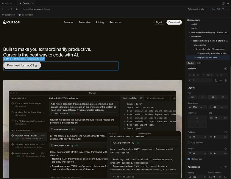
That apply step is the big new thing.
We've had “tweak CSS in the browser” for more than a decade. And we’ve had visual editors like Wordpress or Webflow around for forever. The hard problem is translating a change you made on a rendered page into the right edit in the right file, using the same conventions your existing repo already uses.
Now, if you get the UI looking right, then tell the Cursor agent to apply it, the agent searches for and updates the underlying code. It moves AI workflows from “DevTools screenshot plus instructions” toward “visually design a diff your team can review.”
A useful mental model is that Cursor’s design mode is two loops packaged into one: a visual loop (adjust styles, see updates) and a code loop (agent edits repo, hot reload shows reality).
Cursor sits on top of your local environment, so step one is always running your app locally (e.g., npm run dev) and pointing Cursor’s internal browser to your localhost.
And, just in case it needs to be said, make sure you’re working on a new Git branch. Things can get wonky pretty fast in this mode, and Cursor’s undo doesn’t always do what you expect.
Once you’re set up, you have two ways to edit:
- Manual controls: You can select elements and tweak standard CSS properties or React props in the sidebar. Cursor attempts to map these to your existing CSS variables/tokens, though it often misses or defaults to raw values.
- Point and prompt: You can select an element and simply type instructions like "Make this spacing consistent with the header." This is useful for non-designers or for broad changes that would require touching multiple CSS properties and underlying JS code.
Here’s how it all looks in practice:
Until you hit Apply, your changes are temporary client-side overrides. If you refresh the page now, you lose everything.
Clicking Apply, triggers the agent to analyze your visual tweaks, search your file system for the corresponding code, and write the edit.
Once the edit finishes, your local hot reload kicks in, and the applied code shows in the browser.
The last step is the same as any other coding: review.
Make sure the agent didn’t break other states of the component (Cursor struggles with this). Check that the changes work across screen sizes. It’s pretty easy to get complacent in this workflow, since everything looks right at first glance.
Then, you review and commit the code just like any other dev task.
The Visual Editor makes Cursor look like a Figma killer. As we've written about before, it is better to use your repo as your source of truth for designs, so if you could get designs done all inside the IDE, it would be a win-win.
But the reality is that Cursor is still a software engineering tool. And there's a lot of barriers to setup for folks who aren't already developers.
If you're coming from Figma, the UX will feel jarringly rigid:
- No multi-select: You can't hold shift and select three buttons to change their padding at once. For that matter, you can't select components. Selecting generally is finnicky.
- No easy "Undo": Command + Z doesn't work the way you think. For instance, you can't undo your last slider movement; you have to revert the code change or manually reset the property.
- Messy Layers: You get a DOM tree that tells you... not a lot. Navigating complex pages is a little bit of hell.
- No draggable canvas: You're working with a webpage, and that's it. You can't focus in on one area or easily set a custom zoom level.
If someone can't reliably run your repo today, Cursor Design Mode doesn't change that.
To even boot up Cursor's design mode, you need the repo cloned, dependencies installed, environment variables configured, and a dev server running without errors.
And to make changes safely, you need to be able to use Git and GitHub effectively (as per your org's eng department's preference), as well as understand how to submit those changes to your development team for review.
For an engineer, that's just a Tuesday. But for a designer or product manager, that’s a big nonstarter. The barrier isn’t, “can you drag a slider?” It’s “can you operate the company’s dev environment and recover when it fails.”
When you click Apply, the agent faces a deceptively difficult question: Where exactly does this change live in the code?
In a modern codebase, a button's style isn't just one line of CSS. It could be hidden in a Tailwind utility, a global theme file, or a reusable component library. Because the agent can only see the rendered page and the raw text files, it lacks the connective tissue between them. It has to guess.
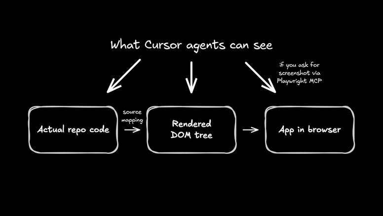
When it guesses, two things usually go wrong:
- It gets confused by state: The AI sees a gray button and might hardcode
color: gray, not realizing the button is only gray because it’s currently in a disabledstate. This breaks your logic. - It creates duplicates: Agents are bad at indexing what you already have. Instead of updating your existing
<PrimaryButton />, it often generates a brand new button with inline styles.
The result is design drift, where you end up with five slightly different versions of the same component because the AI didn't know how to reuse the first one.
Cursor’s Visual Editor is a real, useful improvement for developer UI iteration. It's also pushing the category forward, which is good for everyone building in this space.
But if you want designers and PMs to contribute without becoming part-time engineers, you need a different architecture. A visual editor is just the surface; the system underneath decides whether it scales.
Builder is designed to solve the entire problem by using agents to manage the development environment in the cloud.
Cursor’s visual capabilities are relatively new; it feels like Chrome DevTools with a nicer sidebar. It's functional, but it's rigid.
Builder has been refining visual editing for years, and it brings that maturity to your codebase.
- Multi-select: You can select a group of cards and adjust their spacing simultaneously.
- Component selection: You aren't just clicking divs; you're clicking Components.
- Canvas feel: You can pan, zoom, and navigate the workspace in a way that feels like a design tool, not a web browser.
It bridges the gap between the freedom of a canvas and the constraints of the DOM.
Cursor runs on your machine. Builder runs in a container you don't have to set up.
This solves the biggest friction point mentioned above: setup. With Builder, nobody on the design or product team needs to install Node, Docker, or Git. They don't need to worry about environment variables or conflicting dependencies. They don't need a high-end engineering laptop to compile the app.
In the Cursor workflow, you’re managing the git state manually via the terminal. In Builder, the workflow starts by clicking a "Plus New Branch" button.
Behind the scenes, Builder spins up the container, runs the dev server, creates a fresh git branch, and sets up the preview environment. The user just sees their app appear in the visual editor, ready to edit.
Builder solves the "guessing" problem by instrumenting your code. It gives the agent a deterministic map—down to the exact line number—of which code controls every pixel on the screen.
When you make a visual edit in Builder, the agent isn't searching through files or hallucinating a location. It already knows exactly where to apply the change.
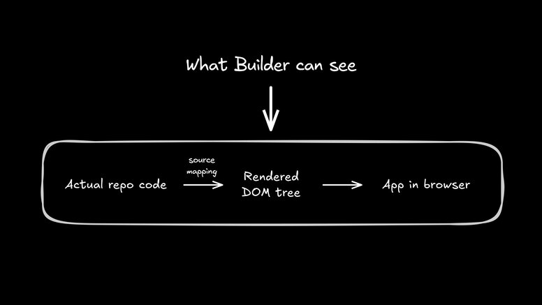
This has a massive impact on performance. Because the where is already solved, we find that smaller, faster models (like Claude Haiku) can successfully handle UI changes that would typically require the heavy lifting (and high cost) of larger models.
The "handoff” has always been the bottleneck of frontend development. In the traditional workflow, a PM writes a requirement in a ticket, a designer draws a static picture, and a developer is tasked with translating both into code.
This turns the developer into a middleman. They’re forced to spend expensive engineering hours on pixel-pushing—adjusting padding, swapping colors, and tweaking font sizes—rather than focusing on logic or architecture. It’s a game of telephone where velocity slows down, designs drift, and product intent gets lost.
Builder allows teams to break this loop by changing who gets assigned the ticket.
Because Builder runs in the cloud (no local setup) and handles the source mapping (no code ambiguity), PMs and designers no longer stop at the Jira ticket or Figma file.
Instead, the PM can fix a typo or test UX directly. The designer can tweak spacing or mobile layout themselves. They verify the changes look right, because they’re looking at the actual production build.
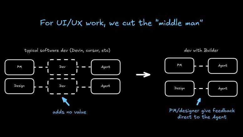
Then, developers have less to do. Instead of implementing changes, they review an existing PR. They verify code quality and approve the merge. This frees devs up to work on things that match their skill sets.
Now, the person who knows the product direction best (the PM) can get hands on with it. The person who cares most about visual details (the designer) controls them. And the person who cares more about code health (the developer) stays on as the repo gatekeeper.
Cursor's visual editing is a genuine step forward for solo developers. If you already have the repo running locally and know how to debug state, it speeds up your personal iteration loop significantly.
But for teams, it doesn't kill Figma because it doesn't solve the collaboration gap. Until your design tool can run without a terminal and map pixels to code deterministically, it remains an engineering utility, not a collaborative workspace.
If you want to let your designers and PMs contribute directly to the codebase without becoming part-time engineers, give Builder a try.


