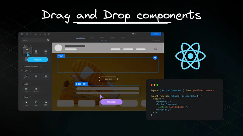
Drag and drop to build pages visually with your React components
Last updated July 6, 2023.
If you've ever had to stop coding for minor UI component edits, you know it'd be so much more efficient if non-dev teammates could do it themselves.
Just as developers reuse components, non-dev teammates can too — in an intuitive, drag-and-drop UI.
With your custom components in Builder, you can:
- Create any component your team needs
- Configure options for variability
Your non-dev teammates can:
- Use and reuse your components with drag-and-drop
- Iterate endlessly
- Publish when they're ready
This tutorial shows you how to integrate your custom React components in the following sections:
- Integrating with Builder
- Creating a custom React component
- Registering your component with your Builder app
- Using your new component in Builder's drag-and-drop editor
This tutorial uses Next.js, but you can integrate with any framework, including React-based frameworks such as Remix, Hydrogen, Gatsby, App Router, as well as other non-React-based frameworks such as Qwik, Vue, Nuxt, Svelte, and Angular.
For instructions on integrating with other frameworks, read Integrating Pages and Registering Custom Components.
Before following these steps to generate a Next.js app, make sure you have Node.js 12.22.0 or later on your computer.
Tip: This section is optional. If you already have a Next.js app, you can skip to the next section, Adding Builder as a Dependency.
At the command line, run the following command to generate a Next.js app:
The following is the configuration that this tutorial uses. Note that this example is using all of the defaults, except for no for the App Router. If you prefer to use the App Router instead, read the guide for integrating the Next.js App Router.
Change directory with the cd command:
Open this directory in your favorite code editor.
At the command line, use npm to install Builder:
Start the development server with npm:
Keep your editor open because we'll come back after some set up in Builder.
For more detailed information on Next.js, check out the official Next.js Getting Started.
Create a page in the pages directory called [...page].tsx (make sure to include the brackets and ellipses).
Tip: If you don't have a pages directory, be sure to create one. If you prefer to use the App Router instead, read the guide for integrate the Next.js App Router.
Paste the following code:
This section explains what the code in is doing at a high level. For more detailed information, see the Next.js documentation.
After the imports, you specify the Builder Public API Key and, with builder.init(), initialize connect your app to Builder.
The getStaticProps() function tells you what paths the app is building. Here, Builder gets the page and creates the URL, otherwise, if there's no page, you'll get null and a 404.
revalidate: 5 means that Next.js attempts to re-generate the page under these conditions:
- When a request comes in
- At most once every 5 seconds
- To check if Builder has updates to the page
The getStaticPaths() function returns a list of page URLs, omits unnecessary data for creating the list.
The last section is a regular React component called Page(). It gets the page data and checks that Builder is present. If there's no page and no Builder, Next.js returns a 404. Otherwise, you get your Builder page.
Builder adds the ability for your team members–even those who don't code–to create pages and iterate on ideas with a drag-and-drop interface.
Head over to Builder.io to sign up for an account if you don't already have one. Come back when you're logged in.
To enable Builder to open your site in the visual editor, you will need to provide a URL that we can open which has the Builder rendering component in it.
Go to the /models page in Builder and choose your page model.
Then, set the Preview URL to http://localhost:3000. Be sure to include the http://.
For more information on preview URLs, read Editing and Previewing Your Site.
You can find and copy your Public API Key with the following steps:
- Within your Builder Space, press
Cmd/Ctrl + kto open the Command Palette. - Start to type the letters API into the search field to filter results.
- Click your API key to copy to your clipboard.
Alternatively, you can also find your Public API Key in Account Settings for the Space:
- Within your Builder Space, go to the Account Settings section.
- Click the copy icon to the right of the Public API Key field.
The video below shows both ways to find the Public API Key.
Now, head back to pages/[...page].tsx and paste this key as the value for BUILDER_API_KEY.
For more information, read Using Builder API Keys.
Currently, when you go to http://localhost:3000, you should get a 404 page. This is because your app is not ready for you to provide a page to render.
To give your app something to work with, click on the Content icon in the left sidenav:
- Go to the Content section of Builder.
- Click + New Entry and select Page.
- Name the page; for example, home. Builder auto-generates a URL based on the name you provide, but you can customize the URL if you like. This example uses the URL of
/to specifylocalhost:3000. - Choose the blank template.
- Drag in a Text block and something like, "I did it!".
- When your page is ready, click the Publish button.
The following video demonstrates creating and publishing a Page:
Go to http://localhost:3000 and check out your work. Well done!
If you're getting a 404 but aren't sure why, check these things:
- Make sure you've published your page in Builder by clicking the Publish Draft button on the upper right corner.
- Check the URL. If you name the page
test2for example, Builder adds a hyphen, so that the URL segment istest-2. - Check that your browser allows insecure content.
- Make sure your dev server is running (sometimes restarting helps).
For more information on using Next.js or other frameworks with Builder, read the Integrating Pages official documentation.
In the root of your project, create a folder called components.
Inside the components directory, create a file called heading.tsx.
Paste the following code into heading.tsx and save.
Here, we register a Heading component with Builder.io using the Builder.registerComponent() method. Our component returns an <h1> with color and title props.
We load the component asynchronously using the Next.js' dynamic() function, which imports the ./heading file and extracts the Heading component. Next, we define the title and color inputs with default values. The ssr option set to true specifies that the component should be rendered server-side (SSR).
In [...page].tsx, import your new custom component.
Log into Builder and open the space that you have connected to your app. If you need some guidance on how to configure your app and Builder together, read Setting up visual drag-and-drop page building with Next.js.
- Go to Content and open a page.
- In the Insert tab, open the Custom Components section.
- Drag in the custom component, here called Heading. The heading displays on the page.
- With the heading selected, open the Options tab to display the block options where you can edit the title and color.
On the right of the screen, the Options panel contains the inputs or props we told Builder about in builder.registerComponent(). The panel includes the title and color along with their default values.
The following video shows this process:
Tip: To develop your Builder work on localhost, you have to configure Builder by pointing to a page that has a <BuilderComponent /> on it and your components registered.
For step-by-step instructions on configuring Builder to use localhost, check out the Getting your API Key and setting your URL section of that article.
The following image shows how the code corresponds to what's in Builder's UI. Everything we declared in builder.registerComponent() is present in the Insert and Options panels. The name Heading along with our inputs, and even our default values populate the Builder interface.

To display your component in the browser, click the green Publish button in the upper right of the browser and being sure you're serving your app locally, go to localhost/your page . For example, if you used the about page, go to http://localhost:3000/about.
Tip: For the most up-to-date content on using custom components in Builder and instructions for other frameworks, check out the official documentation on Integrating Custom Components.
Builder has a lot of other inputs you can configure in your custom component. Check out Input Types in Builder for a comprehensive list.
Tip: Visit our React and Builder.io Hub