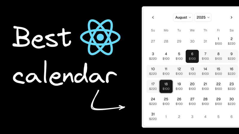
React calendar components: 6 best libraries for 2026
Updated on March 25, 2026.
You need a React calendar component that actually works. Not one that looks good in the demo but breaks when users try to select February 29th, crashes on mobile, or requires three weeks of CSS wrestling to match your design system.
This is your shortcut to the right choice. Here are six libraries ranked by real-world performance. We declare one clear winner for most projects, plus the specific cases where alternatives make sense.
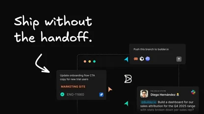
The library choice is the easy part. Matching it to your design system — that's where hours disappear. Try Builder.io free → and style any React calendar component visually in minutes, no CSS required.
Before diving into features and ranks, ask yourself:
- Do I just need a calendar that works?
- Do I need a pixel-perfect, on-brand calendar component?
- Or do I need a big calendar UI like Calendly?
This isn't about technical superiority—it's about matching the tool to your actual problem:
- "I just need a calendar that works." →
react-datepickerships complete. Fast, easy, reliable. - "I need an on-brand calendar." →
react-day-pickergives you the foundation you need to match your design system. Shadcn users should use that system’s calendar component. It’s based on this one. - "I need a big calendar UI. Think Calendly or Google Calendar." →
react-big-calendaris the answer.
react-datepicker is a very popular React calendar component with 2.7 million weekly downloads. Developed by HackerOne, there's a good reason it earns the top spot: it just works.
The numbers:
- 8,267 GitHub stars and climbing
- Battle-tested by HackerOne, major enterprises, and thousands of others
- Feature-rich library, including support for custom date ranges, highlighted dates, time, displayed week numbers, multiple months, and even financial quarters
Why it wins:
- Handles edge cases you forgot about (leap years, timezones, locales)
- Time selection that actually works
- Styling that's customizable without being painful
- Documentation that doesn't suck
Pros: Works out of the box, excellent time selection, proper i18n, accessibility built-in
Cons: Slightly larger bundle, CSS customization can be tricky, limited visual customization without deep CSS knowledge
The reality: While react-datepicker handles functionality perfectly, customizing it for your brand can take hours of CSS wrestling. Most developers end up with a component that works but doesn't match their design system.
Eliminating the customization bottleneck: Fusion lets you combine react-datepicker's reliability but skip the CSS headaches entirely. Start with react-datepicker's proven functionality, then style it visually in minutes using Fusion; no CSS required.
Bottom line: This is the Toyota Camry of calendar components. It's reliable, practical, and gets the job done without drama.
Most developers don't realize that react-day-picker (a.k.a. DayPicker) powers a massive chunk of the modern React calendar ecosystem. With 6+ million weekly downloads and 6,400+ GitHub stars, it's the foundation for Shadcn's calendar component, countless other design libraries, and thousands of custom implementations.
Why it's the hidden champion:
- Powers the ecosystem - dependency in major projects like Shadcn/UI
- Modern architecture - Built for React hooks, not legacy patterns
- Ultimate flexibility - Headless approach gives you complete control
- TypeScript-native - Written in TypeScript from day one
- Zero dependencies - Just React, nothing else
When react-day-picker wins: Building design systems, need maximum customization, want modern React patterns, creating white-label solutions
Pros: Headless flexibility, modern architecture, TypeScript-first, powers other solutions, zero dependencies
Cons: More setup required, styling from scratch, steeper learning curve
The design system reality: react-day-picker is what you reach for when building calendar components that need to match exact brand requirements. It's the Swiss Army knife that design system teams love because it doesn't impose any visual opinions.
Taking a visual first approach: Skip the headless complexity and use Fusion instead. Get react-day-picker's flexibility with drag-and-drop styling that non-developers can use.
Our take: This is the ideal enterprise choice. Reach for it when you need a calendar that perfectly matches your brand and design system.
Built on top of react-day-picker with 30+ calendar blocks, Shadcn/UI represents the modern approach to component libraries. It's not just a calendar—it's a philosophy. If you want react-day-picker and already use Shadcn, this is the obvious choice.
What makes it special:
- Copy-paste component architecture (no NPM dependencies)
- Perfect TypeScript integration
- Built for Tailwind CSS ecosystem
- Persian / Hijri / Jalali calendar support
- Unstyled by default (this is a feature)
When Shadcn wins: You're using Tailwind, love copy-paste components, or need design system consistency (Shadcn already in use).
Pros: Zero dependencies, incredible flexibility, TypeScript-first, beautiful defaults
Cons: Requires TailwindCSS + Shadcn buy-in. The combo is powerful, but maintaining consistency across multiple calendar variants requires serious Tailwind expertise.
Skipping the handoff friction: With Fusion’s visual AI, anyone can add or modify the Shadcn calendar and edit it visually; no Tailwind knowledge required, no developer bottleneck, no heavy maintenance burden.
Our take: If you're in the Tailwind/TypeScript ecosystem and value customization over convenience, this could be your #1.
Inspired by FullCalendar, this isn't competing with the others—it's solving a different problem. Choose react-big-calendar if you need a comprehensive calendar interface that supports event management and scheduling.
Think Google Calendar, not date picker. Perfect for:
- Booking systems
- Team schedulers
- Project management tools
- Any app where events are the focus
What it does well:
- Four options for date formatting and localization (Moment.js, Globalize.js, date-fns, Day.js)
- Drag-and-drop that works
- Multiple views (month, week, day, agenda)
- Event overlap handling
Pros: Unmatched for events, flexible localization, handles complex scheduling
Cons: Overkill for date selection, requires date library, steep learning curve, complex SASS files
The team handoff solution: Fusion lets you build Google Calendar-style interfaces visually using react-big-calendar. Just drag, drop, style, ship. No SASS debugging required.
Bottom line: Don't use this for date pickers. Do use this to build the next Calendly.
With over 800,000 weekly downloads, react-calendar proves that sometimes simple wins.
The minimalist philosophy:
- Zero dependencies beyond React
- Ultimate flexibility and customization
- Small bundle size
- You control everything
Perfect for: Performance-critical apps, full control needs, simple date selection, bundle size matters
Pros: Lightweight, complete control, no dependencies, predictable
Cons: react-calendar gives you complete control, which means you're responsible for everything. Weekend highlighting? Write the logic. Holiday styling? Custom CSS. Responsive design? Media queries. It's perfect if your team has strong CSS skills and time to spare.
Avoiding the CSS skills tax: Fusion gives you complete visual control without writing a single line of CSS. Get react-calendar's flexibility with drag-and-drop simplicity.
Our take: Great for teams with strong CSS skills. Not great for rapid prototyping.
Material UI’s Date Calendar component lets users select a date without any input or popper / modal and integrates seamlessly with the MUI ecosystem, powering enterprise applications worldwide.
The enterprise argument:
- Battle-tested at scale
- Professional support available
- Comprehensive accessibility
- Material Design consistency
Pros: Enterprise polish, excellent accessibility, comprehensive theming, TypeScript-native
Cons: MUI's calendar is beautifully polished but locked into Material Design patterns. Need it to match your startup's quirky brand? You're fighting the framework. Want a calendar that doesn't scream "Google"? Good luck with that theming system.
Escaping the MUI design system: Fusion starts with MUI's enterprise-grade functionality but lets you create any design aesthetic—no theming system battles required.
Bottom line: Choose this if you're in the MUI ecosystem or need enterprise-grade consistency.
Most projects should start with react-datepicker. It handles the common cases well and saves you from debugging timezone edge cases at 2 AM. Choose react-big-calendar for event-heavy apps, react-day-picker for design systems, or stick with whatever matches your existing stack (Shadcn, MUI). The real bottleneck isn't picking the library; it's the styling work that comes after.
If your team spends more time wrestling with CSS than building features, visual development platforms like Fusion can eliminate that friction.
Frequently Asked Questions: React Calendar Components
What is the best React calendar component in 2025?
For most projects, react-datepicker is the top pick. It has 2.7M weekly downloads, handles edge cases like leap years and timezones out of the box, and includes built-in accessibility and time selection.
Which library is best for matching a custom design system?
react-day-picker — it's headless, zero-dependency, TypeScript-native, and the foundation Shadcn/UI builds on. Maximum visual control, minimum opinion.
Should I use Shadcn/UI's calendar if I'm already on Tailwind?
Yes. It's react-day-picker under the hood, requires no NPM install (copy-paste architecture), and slots perfectly into a Tailwind + TypeScript stack. Obvious choice if you're already in that ecosystem.
What's the best React calendar for event scheduling (Calendly-style)?
react-big-calendar. It's built for event management — month/week/day/agenda views, drag-and-drop, and multiple date library adapters. Don't use it as a date picker; use it to build a full scheduling UI.
What's the most lightweight option?
react-calendar — zero dependencies, small bundle, complete control. Best for performance-critical apps where your team has strong CSS chops.
When does MUI Date Calendar make sense?
When you're already committed to the MUI ecosystem and need enterprise-grade accessibility and polish. Tradeoff: it's visually locked into Material Design and hard to push outside those conventions.
What library does Shadcn/UI's calendar wrap?
react-day-picker (6M+ weekly downloads). Knowing this matters because it means anything that works with react-day-picker is compatible with Shadcn's calendar.
How do I customize a React calendar to match my brand?
Depends on the library: react-datepicker needs CSS overrides, react-day-picker/react-calendar require styling from scratch, Shadcn uses Tailwind classes, MUI uses its theme API. Builder.io Fusion can shortcut all of it visually.
Does react-datepicker support time selection?
Yes — use showTimeSelect, configure timeFormat, and you're done. No extra libraries needed.
Which library has the best accessibility?
react-datepicker and MUI Date Calendar both have solid a11y built in. MUI's is particularly enterprise-ready with full Material Design accessibility standards baked in.