8/21 demo: Building component libraries from Figma with AI

What are best AI tools? Take the State of AI survey

Builder logo
builder.io
Contact sales
Builder logo
builder.io

Blog

Home

Resources

Blog

Forum

Github

Login

Signup

×

Visual CMS

Drag-and-drop visual editor and headless CMS for any tech stack

Theme Studio for Shopify

Build and optimize your Shopify-hosted storefront, no coding required

Resources

Blog

Get StartedLogin

‹ Back to blog

AI

Vibe code immersive 3D effects in one prompt

August 10, 2025

Written By Steve Sewell

Building interactive 3D animations used to require deep WebGL knowledge, custom shaders, and hours of debugging. But lucky for us, not anymore.

With AI-powered coding tools, you can drop a stunning 3D particle system into your site with a single prompt and some borrowed code.

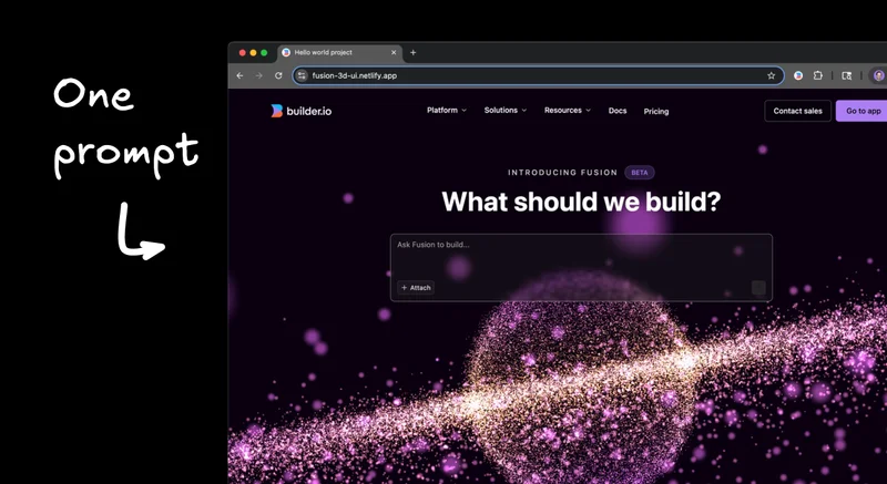
I'm going to show you how I added this interactive 3D planet animation to a homepage using Builder.io Fusion, but this technique works with pretty much any AI coding tool that can handle visual updates.

The magic prompt

I found a cool 3D planet animation online and decided to integrate it into my basic, boring homepage that needed some pizzazz.

I opened up Fusion and gave it the simplest possible instruction:

"Add this 3D animation to the hero."

Then I pasted the code snippet:

import * as THREE from "https://cdn.skypack.dev/three@0.136.0";
import {OrbitControls} from "https://cdn.skypack.dev/three@0.136.0/examples/jsm/controls/OrbitControls";

console.clear();

let scene = new THREE.Scene();
scene.background = new THREE.Color(0x160016);
let camera = new THREE.PerspectiveCamera(60, innerWidth / innerHeight, 1, 1000);
camera.position.set(0, 4, 21);
let renderer = new THREE.WebGLRenderer();
renderer.setSize(innerWidth, innerHeight);
document.body.appendChild(renderer.domElement);
window.addEventListener("resize", event => {
  camera.aspect = innerWidth / innerHeight;
  camera.updateProjectionMatrix();
  renderer.setSize(innerWidth, innerHeight);
})

let controls = new OrbitControls(camera, renderer.domElement);
controls.enableDamping = true;
controls.enablePan = false;

let gu = {
  time: {value: 0}
}

let sizes = [];
let shift = [];
let pushShift = () => {
  shift.push(
    Math.random() * Math.PI, 
    Math.random() * Math.PI * 2, 
    (Math.random() * 0.9 + 0.1) * Math.PI * 0.1,
    Math.random() * 0.9 + 0.1
  );
}
let pts = new Array(50000).fill().map(p => {
  sizes.push(Math.random() * 1.5 + 0.5);
  pushShift();
  return new THREE.Vector3().randomDirection().multiplyScalar(Math.random() * 0.5 + 9.5);
})
for(let i = 0; i < 100000; i++){
  let r = 10, R = 40;
  let rand = Math.pow(Math.random(), 1.5);
  let radius = Math.sqrt(R * R * rand + (1 - rand) * r * r);
  pts.push(new THREE.Vector3().setFromCylindricalCoords(radius, Math.random() * 2 * Math.PI, (Math.random() - 0.5) * 2 ));
  sizes.push(Math.random() * 1.5 + 0.5);
  pushShift();
}

let g = new THREE.BufferGeometry().setFromPoints(pts);
g.setAttribute("sizes", new THREE.Float32BufferAttribute(sizes, 1));
g.setAttribute("shift", new THREE.Float32BufferAttribute(shift, 4));
let m = new THREE.PointsMaterial({
  size: 0.125,
  transparent: true,
  depthTest: false,
  blending: THREE.AdditiveBlending,
  onBeforeCompile: shader => {
    shader.uniforms.time = gu.time;
    shader.vertexShader = `
      uniform float time;
      attribute float sizes;
      attribute vec4 shift;
      varying vec3 vColor;
      ${shader.vertexShader}
    `.replace(
      `gl_PointSize = size;`,
      `gl_PointSize = size * sizes;`
    ).replace(
      `#include <color_vertex>`,
      `#include <color_vertex>
        float d = length(abs(position) / vec3(40., 10., 40));
        d = clamp(d, 0., 1.);
        vColor = mix(vec3(227., 155., 0.), vec3(100., 50., 255.), d) / 255.;
      `
    ).replace(
      `#include <begin_vertex>`,
      `#include <begin_vertex>
        float t = time;
        float moveT = mod(shift.x + shift.z * t, PI2);
        float moveS = mod(shift.y + shift.z * t, PI2);
        transformed += vec3(cos(moveS) * sin(moveT), cos(moveT), sin(moveS) * sin(moveT)) * shift.w;
      `
    );
    //console.log(shader.vertexShader);
    shader.fragmentShader = `
      varying vec3 vColor;
      ${shader.fragmentShader}
    `.replace(
      `#include <clipping_planes_fragment>`,
      `#include <clipping_planes_fragment>
        float d = length(gl_PointCoord.xy - 0.5);
        //if (d > 0.5) discard;
      `
    ).replace(
      `vec4 diffuseColor = vec4( diffuse, opacity );`,
      `vec4 diffuseColor = vec4( vColor, smoothstep(0.5, 0.1, d)/* * 0.5 + 0.5*/ );`
    );
    //console.log(shader.fragmentShader);
  }
});
let p = new THREE.Points(g, m);
p.rotation.order = "ZYX";
p.rotation.z = 0.2;
scene.add(p)

let clock = new THREE.Clock();

renderer.setAnimationLoop(() => {
  controls.update();
  let t = clock.getElapsedTime() * 0.5;
  gu.time.value = t * Math.PI;
  p.rotation.y = t * 0.05;
  renderer.render(scene, camera);
});

Original Three.js code from this CodePen

The great part about this is that LLMs are really good at code translation.

That Three.js code gets automatically adapted to work in my React website, integrated exactly where I want it, with proper component structure and everything. Regardless of your site structure, it can translate it to yours as well.

This is what is beautiful about vibe coding in my opinion - it makes existing code massively more reusable, regardless of your stack.

The planet looks cool, but I wanted it to be interactive even when there's text or other elements on top of it. The trick here is telling the AI to add pointer-events: none to any layers you don't want to intercept clicks.

This way, users can interact with the 3D animation through the text, buttons stay clickable, but everything else passes through to the planet underneath. It's like having an interactive background that actually works.

I also added a backdrop blur to the text area to make it pop against the animation. In Fusion, you can do this in design mode by selecting the text area and setting the backdrop filter property to blur(3px), or whatever level looks good to you.

The whole thing comes together nicely - you get this dreamy, interactive background that doesn't interfere with usability.

Once the basic animation is working, the real fun begins. Since this is AI, you can use natural language to modify anything about the animation.

Want it to look like a galaxy instead of a planet? Just tell it: "Instead of the 3D animation looking like a planet, make it look like a galaxy."

Typos don't matter (thank god), and the changes happen in real-time. It's pretty awesome having an entire particle system at your fingertips that you can change and manipulate just through conversation.

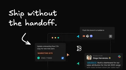
Even though I'm working with AI, I still want proper version control and code review. The cool thing about Fusion is that it integrates with your existing development workflow.

When I'm ready to deploy, I can send a pull request with my changes. The PR gets a nice title and description, and I can check out the actual code changes to make sure everything looks right.

The AI translated that raw Three.js into clean React components that I'd actually want in my codebase. If I have feedback, I can leave a comment on the PR, tag @builderio-bot, and make requests like "move this component to be in its own file."

Just like working with humans (but faster), the agent replies and pushes up changes when it's done.

As a bonus, let me show you another example of this copy-paste technique. I found a cool CodePen with a glowing text animation effect and wanted to add it to my input field.

I got rid of the planet animation for this experiment (they might collide visually), copied the code from the CodePen, and gave Fusion another simple prompt:

"Add this cool effect to my text area"

Then pasted the code:

@font-face {
  font-family: "Mona Sans";
  src: url("https://assets.codepen.io/64/Mona-Sans.woff2")
      format("woff2 supports variations"),
    url("https://assets.codepen.io/64/Mona-Sans.woff2")
      format("woff2-variations");
  font-weight: 100 1000;
}

@property --hue {
  syntax: "<number>";
  inherits: true;
  initial-value: 0;
}
@property --rotate {
  syntax: "<number>";
  inherits: true;
  initial-value: 0;
}
@property --bg-y {
  syntax: "<number>";
  inherits: true;
  initial-value: 0;
}
@property --bg-x {
  syntax: "<number>";
  inherits: true;
  initial-value: 0;
}
@property --glow-translate-y {
  syntax: "<number>";
  inherits: true;
  initial-value: 0;
}
@property --bg-size {
  syntax: "<number>";
  inherits: true;
  initial-value: 0;
}
@property --glow-opacity {
  syntax: "<number>";
  inherits: true;
  initial-value: 0;
}
@property --glow-blur {
  syntax: "<number>";
  inherits: true;
  initial-value: 0;
}
@property --glow-scale {
  syntax: "<number>";
  inherits: true;
  initial-value: 2;
}

@property --glow-radius {
  syntax: "<number>";
  inherits: true;
  initial-value: 2;
}

@property --white-shadow {
  syntax: "<number>";
  inherits: true;
  initial-value: 0;
}

:root {
  // utilities
  --debug: 0;
  --supported: 0;
  --not-supported: 0;

  // Pen vars
  --card-color: hsl(260deg 100% 3%);
  --text-color: hsl(260deg 10% 55%);
  --card-radius: 3.6vw;
  --card-width: 35vw;
  --border-width: 3px;
  --bg-size: 1;

  --hue: 0;
  --hue-speed: 1;

  --rotate: 0;
  --animation-speed: 4s;

  --interaction-speed: 0.55s;
  --glow-scale: 1.5;
  --scale-factor: 1;
  --glow-blur: 6; // 6
  --glow-opacity: 1; // 0.6
  --glow-radius: 100; // 100
  --glow-rotate-unit: 1deg;
}

body::before,
body::after {
  content: "CSS.registerProperty is supported ✅";
  position: absolute;
  display: block;
  top: 8px;
  left: 0;
  right: 0;
  margin: auto;
  width: calc(100% - 160px);
  max-width: 380px;
  height: auto;
  padding: 8px;
  border-radius: 8px;
  background: hsl(114deg 51% 48%);
  color: white;
  text-align: center;
  font-family: sans-serif;
  z-index: var(--supported, 0);
  opacity: var(--supported, 0);
}

body::after {
  content: "CSS.registerProperty is NOT supported ❌";
  background: hsl(0deg 51% 48%);
  z-index: var(--not-supported, 0);
  opacity: var(--not-supported, 0);
}
body::before,
body::after {
  display: none !important;
}

html,
body {
  height: 100%;
  width: 100%;
  padding: 0;
  margin: 0;
}

*,
*:before,
*:after {
  outline: calc(var(--debug) * 1px) red dashed;
}

body {
  background-color: var(--card-color);
  display: flex;
  align-items: center;
  justify-content: center;
  font-family: "Mona Sans", sans-serif;
}

body > div {
  width: var(--card-width);
  width: min(480px, var(--card-width));
  aspect-ratio: 1.5/1;
  color: white;
  margin: auto;
  display: flex;
  align-items: center;
  justify-content: center;
  position: relative;
  z-index: 2;
  border-radius: var(--card-radius);
  cursor: pointer;

  &:hover {
    > div {
      mix-blend-mode: darken;
      --text-color: white;
      box-shadow: 0 0 calc(var(--white-shadow) * 1vw)
        calc(var(--white-shadow) * 0.15vw) rgb(255 255 255 / 20%);
      animation: shadow-pulse calc(var(--animation-speed) * 2) linear infinite;
      &:before {
        --bg-size: 15;
        animation-play-state: paused;
        transition: --bg-size var(--interaction-speed) ease;
      }
    }
    .glow {
      --glow-blur: 1.5;
      --glow-opacity: 0.6;
      --glow-scale: 2.5;
      --glow-radius: 0;
      --rotate: 900;
      --glow-rotate-unit: 0;
      --scale-factor: 1.25;
      animation-play-state: paused;

      &:after {
        --glow-translate-y: 0;
        animation-play-state: paused;
        transition: --glow-translate-y 0s ease, --glow-blur 0.05s ease,
          --glow-opacity 0.05s ease, --glow-scale 0.05s ease,
          --glow-radius 0.05s ease;
      }
    }
  }

  &:before,
  &:after {
    content: "";
    display: block;
    position: absolute;
    width: 100%;
    height: 100%;
    border-radius: var(--card-radius);
  }

  > div {
    position: absolute;
    width: 100%;
    height: 100%;
    background: var(--card-color);
    border-radius: calc(calc(var(--card-radius) * 0.9));
    display: flex;
    align-items: center;
    justify-content: center;
    font-weight: 800;
    text-transform: uppercase;
    font-stretch: 150%;
    font-size: 18px;
    font-size: clamp(1.5vw, 1.5vmin, 32px);
    color: var(--text-color);
    padding: calc(var(--card-width) / 8);

    span {
      display: inline-block;
      padding: 0.25em;
      border-radius: 4px;
      background: var(--text-color);
      color: black;
      margin-right: 8px;
      font-weight: 900;
    }

    &:before {
      content: "";
      display: block;
      position: absolute;
      width: 100%;
      height: 100%;
      border-radius: calc(calc(var(--card-radius) * 0.9));
      box-shadow: 0 0 20px black;
      mix-blend-mode: color-burn;
      z-index: -1;
      background: hsl(0deg 0% 16%)
        radial-gradient(
          30% 30% at calc(var(--bg-x) * 1%) calc(var(--bg-y) * 1%),
          hsl(calc(calc(var(--hue) * var(--hue-speed)) * 1deg) 100% 90%)
            calc(0% * var(--bg-size)),
          hsl(calc(calc(var(--hue) * var(--hue-speed)) * 1deg) 100% 80%)
            calc(20% * var(--bg-size)),
          hsl(calc(calc(var(--hue) * var(--hue-speed)) * 1deg) 100% 60%)
            calc(40% * var(--bg-size)),
          transparent 100%
        );
      width: calc(100% + var(--border-width));
      height: calc(100% + var(--border-width));
      animation: hue-animation var(--animation-speed) linear infinite,
        rotate-bg var(--animation-speed) linear infinite;
      transition: --bg-size var(--interaction-speed) ease;
    }
  }

  .glow {
    --glow-translate-y: 0;
    display: block;
    position: absolute;
    width: calc(var(--card-width) / 5);
    height: calc(var(--card-width) / 5);
    animation: rotate var(--animation-speed) linear infinite;
    transform: rotateZ(calc(var(--rotate) * var(--glow-rotate-unit)));
    transform-origin: center;
    border-radius: calc(var(--glow-radius) * 10vw);

    &:after {
      content: "";
      display: block;
      z-index: -2;
      filter: blur(calc(var(--glow-blur) * 10px));
      width: 130%;
      height: 130%;
      left: -15%;
      top: -15%;
      background: hsl(
        calc(calc(var(--hue) * var(--hue-speed)) * 1deg) 100% 60%
      );
      position: relative;
      border-radius: calc(var(--glow-radius) * 10vw);
      animation: hue-animation var(--animation-speed) linear infinite;
      transform: scaleY(calc(var(--glow-scale) * var(--scale-factor) / 1.1))
        scaleX(calc(var(--glow-scale) * var(--scale-factor) * 1.2))
        translateY(calc(var(--glow-translate-y) * 1%));
      opacity: var(--glow-opacity);
    }
  }
}

@keyframes shadow-pulse {
  0%,
  24%,
  46%,
  73%,
  96% {
    --white-shadow: 0.5;
  }
  12%,
  28%,
  41%,
  63%,
  75%,
  82%,
  98% {
    --white-shadow: 2.5;
  }
  6%,
  32%,
  57% {
    --white-shadow: 1.3;
  }
  18%,
  52%,
  88% {
    --white-shadow: 3.5;
  }
}

@keyframes rotate-bg {
  0% {
    --bg-x: 0;
    --bg-y: 0;
  }

  25% {
    --bg-x: 100;
    --bg-y: 0;
  }

  50% {
    --bg-x: 100;
    --bg-y: 100;
  }

  75% {
    --bg-x: 0;
    --bg-y: 100;
  }

  100% {
    --bg-x: 0;
    --bg-y: 0;
  }
}
@keyframes rotate {
  from {
    --rotate: -70;
    --glow-translate-y: -65;
  }

  25% {
    --glow-translate-y: -65;
  }

  50% {
    --glow-translate-y: -65;
  }

  60%,
  75% {
    --glow-translate-y: -65;
  }

  85% {
    --glow-translate-y: -65;
  }

  to {
    --rotate: calc(360 - 70);
    --glow-translate-y: -65;
  }
}
@keyframes hue-animation {
  0% {
    --hue: 0;
  }
  100% {
    --hue: 360;
  }
}

What's cool here is that Fusion automatically spins up a separate branch for this experiment. I can open tons of different branches in different browser tabs, try different ideas for the homepage, send preview links to others for feedback, and pick my favorite approach.

The AI was smart enough to adapt the code to my specific project structure, integrating it completely differently than the previous animation.

On the first shot, it got one small piece wrong - I think it needed another container to prevent the glow from bleeding through. Like working with any developer, I gave it feedback with a screenshot showing what I wanted versus what I got, and told it to fix it, and was very happy with my final result:

The pattern here is what excites me. I can pull inspiration from any code snippet I find online and apply it to my project, regardless of the original context or framework. The AI handles all the translation and integration work.

This technique works especially well for visual effects since you can immediately see if something's working.

This is what excites me about AI-assisted coding. I'm a developer, but I don't know WebGL. I can't write custom shaders. But now I don't have to learn all that just to add some visual flair to a project.

The barrier to entry for this kind of interactive 3D work has dropped to basically zero. Find some code online, paste it in, and tell the AI what you want. The translation and integration happen automatically.

It's not replacing the need to understand code or think through user experience. But it's eliminating the tedious parts - the syntax translation, the integration work, the debugging of library incompatibilities.

Want to see this in action? Here's the final result:

The technique is simple: find some cool code online, paste it into your AI coding tool of choice, and ask it to integrate it where you want. The AI handles the translation and integration work.

I can't wait to see what awesome stuff you build with 3D particle systems. Head over to Fusion to try it out now.

Generate clean code using your components & design tokens
Try FusionGet a demo

Share

Twitter / X
LinkedIn
Facebook
Share this blog
Copy icon
Twitter "X" icon
LinkedIn icon
Facebook icon

Visually edit your codebase with AI

Using simple prompts or Figma-like controls.

Try it nowGet a demo

Design to Code Automation

A pragmatic guide for engineering leaders and development teams

Access Now

Continue Reading
AI3 MIN
Introducing Usage-Based Agent Credits
August 7, 2025
AI4 MIN
Convert HTML to Design in Figma
August 6, 2025
AI6 MIN
How to set up and use the Linear MCP server
August 5, 2025