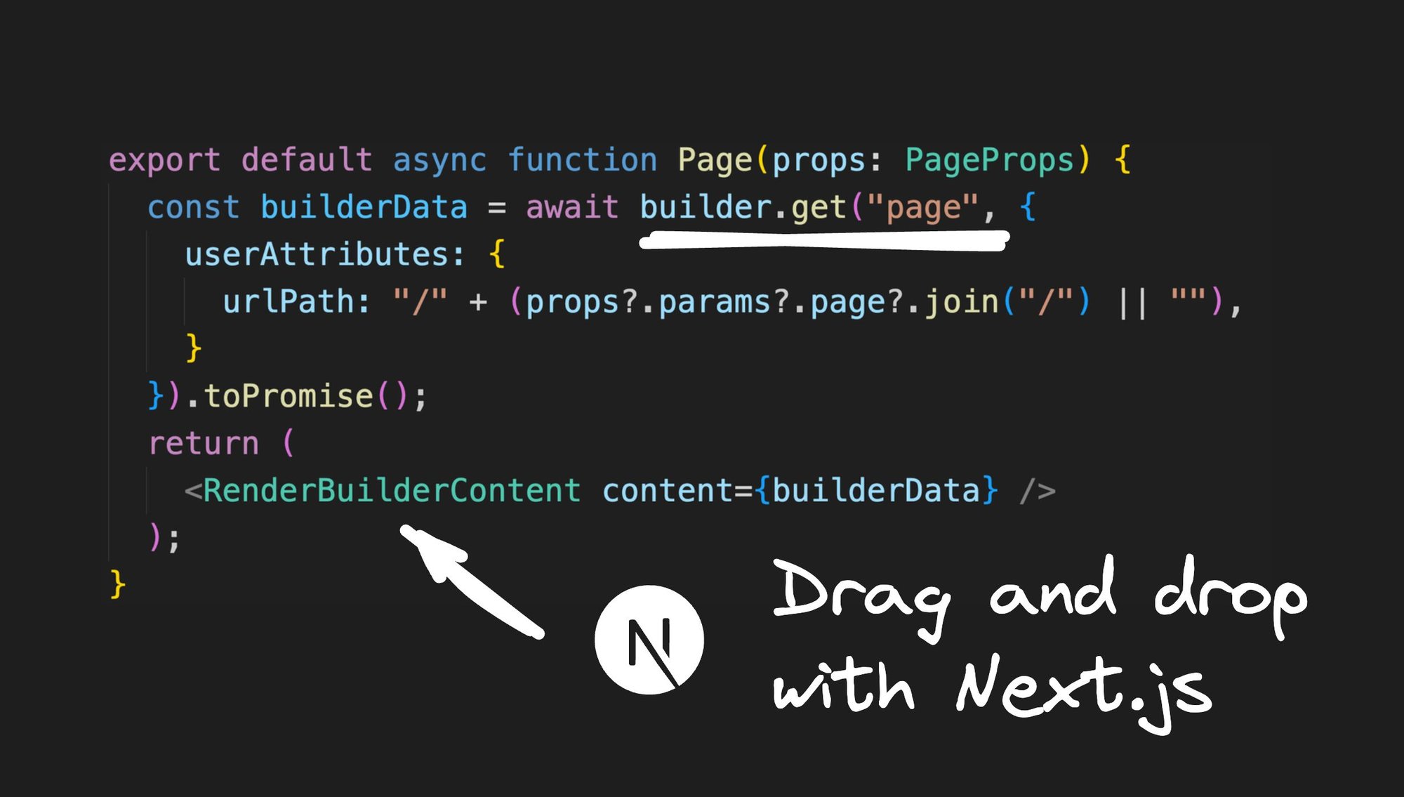
Wouldn't it be amazing if you could easily drag and drop components within your Next.js app, effortlessly building stunning user interfaces without having to dive deep into code?
Well, this blog post has got your back! We're going on a tour of how you can seamlessly integrate visual coding into any corner of your Next.js app. Get set to build new pages visually, play around with CMS data, and even construct sections of your Next.js apps.
The example code used here can be found in this repo.
We wanted to provide a more streamlined experience, similar to what we have done for Qwik, and make incorporating drag-and-drop capabilities into your Next.js app easier.
That's why we have added support for Builder Devtools for Next.js.
If you're starting a new Next.js app, there's a high probability that you plan on using the new App router. Simply create a new app using the following command:
npx create-next-app@latest nextjs-builderThis will generate a Next.js app in a folder of your choosing. You can freely choose between the new App router or the Pages router, based on your requirements.
If you want to start from an existing GitHub repo, use the following command:
npx create-next-app@latest -e <url to github repo>Want to use the code from this post that already has custom components and examples? Use the following command:
npx create-next-app@latest -e https://github.com/BuilderIO/nextjs-builder-starterAlready have an existing Next.js app? No problem! You can easily add drag-and-drop components to it as well. 👇🏽
Once you have a Next.js app to work with, the next step is to install Builder.io. All you have to do is run this single command in your terminal:
npm init builder.io@latestVoilà! This will install the necessary packages and automatically update your Next.js configuration file to enable support for the Devtools.
Now, when you run your Next.js app using npm run dev, you'll notice a user-friendly UI wizard guiding you through the integration process.
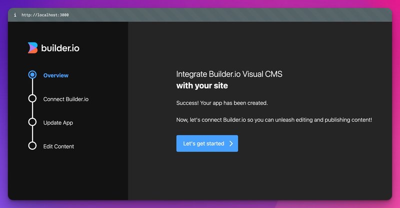
- Click the Let’s get started button.
- Sign up (or log in).
- Authorize Builder:
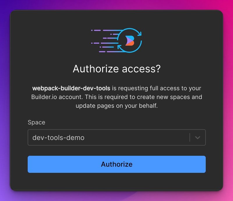
From this point, Devtools will work behind the scenes to update your project with the necessary code.
Once the connection between your app and Builder is done, it’s time to celebrate 🎉.
Next, a button shows that will take you to your app at localhost:3000/builder-demo.
And that’s it. You can now use Builder’s Visual Editor to drag and drop components!
Now, here's the exciting bit. Imagine having a visual drag-and-drop editor nestled right in your website. That's right, you can drag and drop with your own code components or use some nifty built-in components that Builder.io provides.
Hover over a component and select Open in Builder. The Builder Visual Editor will open in a new tab where you can start to drag and drop components.
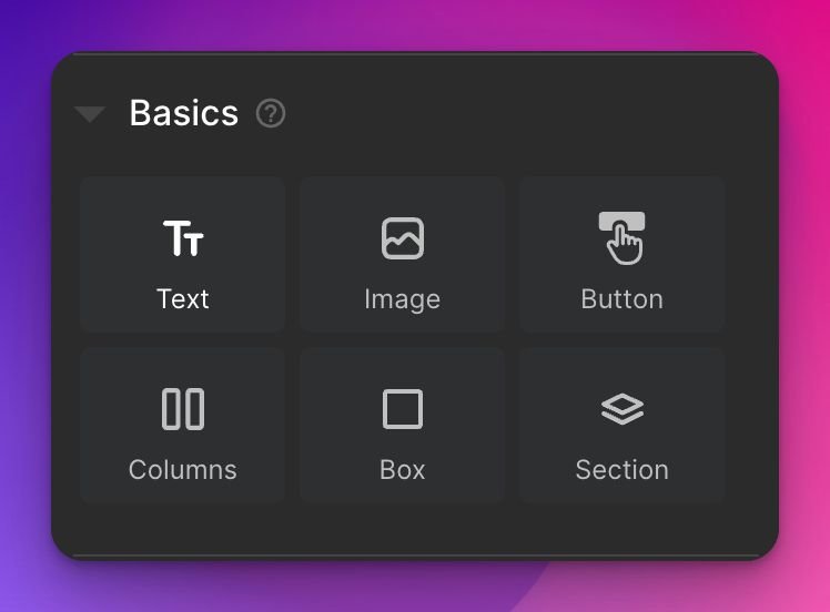
Builder.io offers an array of built-in components that you can use effortlessly. These components are designed to simplify the development process, allowing marketers, designers, or product people to create engaging user interfaces without needing a developer.
They can drag and drop these components to create a page or a section that will become part of your Next.js app without the need to deploy.
More often than not, you want to drag and drop your own components. Registering custom components with Builder is a breeze.
The Devtools displays a list of your unregistered components in the drawer on the right side of the screen. From there, you can select which component you want to register into Builder’s Visual Editor by flipping a switch.
Devtools works behind the scenes to generate the code for you, as below:
Once we’ve registered our components, we can start using them by dragging and dropping them:
Note we’re using DaisyUI and Tailwind in this example, however, you can use any styling solution you have within your Next.js project.
Got your edits all squared away? Just hit the publish button in the top-right corner, and your changes are live. You can even set them up for future dates.
Note that it might take some time for the CDN to invalidate the cache. You might need to clear your cookies and refresh after a minute or so.
Watch How to build a modern site with Next.js and Builder.io for a video version with Jack Herrignton.
Builder is a Visual Headless CMS. We’ve covered what the visual part means above, let’s explore how you can utilize Builder’s headless CMS (Content Management System) features.
In a nutshell, you can store data within Builder and then query it from your Next.js app. This allows data insertion by non-developers that can be queried and consumed through code.
Let’s imagine we want to add a testimonial section to our app. For that, we’d want to have the following:
- The Person’s name
- The testimonial content
- An image of the person
To do so, we can go into Builder, and create a new data model:
Then we need to add our desired properties:
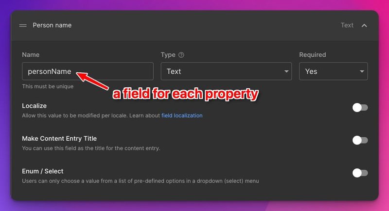
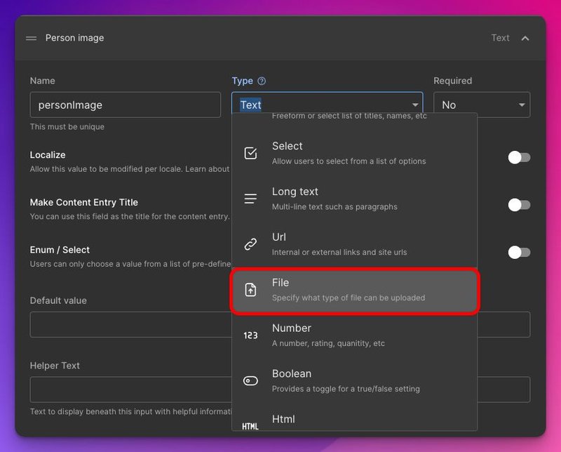
There are a number of types that we can choose for our field types. Notice that for our image we can choose the File type, which would also store our image on Builder’s CDN:
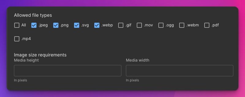
There’s also an option to specify which file types we’d like to allow, as well as setting requirements of size:
If we scroll to bottom we can also have a spoiler peak at how to query our model:
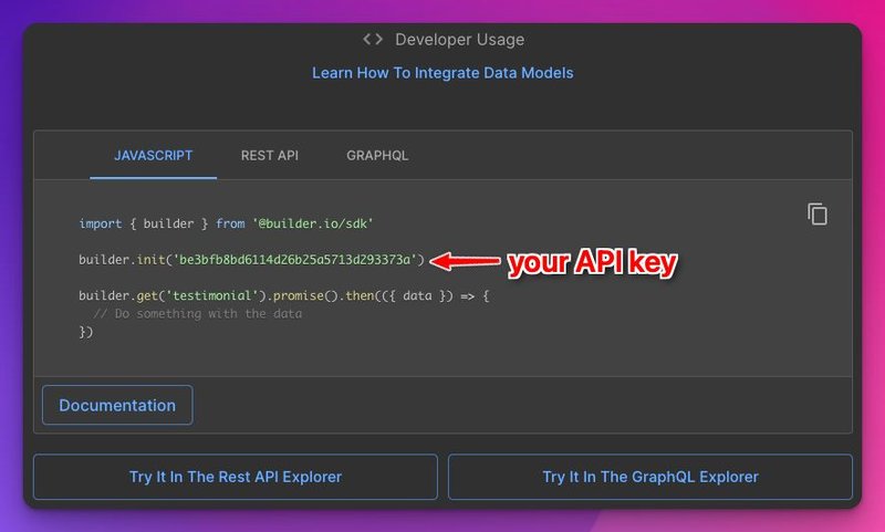
Builder conveniently provides options to query via REST API, GraphQL, or our JavaScript SDK.
Now all we need to do is insert a few entries, like so:
Once we’ve added our entries inside the CMS, we can query them by using one of the methods mentioned above.
To showcase how to work with this, we first need to create a new page.
We can create a page where we’ll get our testimonials:
// src/app/testimonial/page.tsx

import { builder, BuilderContent } from "@builder.io/sdk";

builder.init(process.env.NEXT_PUBLIC_BUILDER_API_KEY!);

export default async function Page() {
  const testimonials = await builder.getAll("testimonial", { prerender: false });
  return (
    <main className="min-h-screen">
      <h1 className="py-20 text-3xl text-center text-teal-500">
        Testimonial page
      </h1>
      <ul className="carousel gap-6 mx-8">
        {testimonials?.map(({ data, id }: BuilderContent) => (
          <li key={id} className="carousel-item">
            <article className="card card-side bg-base-100 max-w-screen-md max-h-96 shadow-xl">
              <figure className="max-w-sm">
                <img width="420" height="420"
                  className="object-cover w-full h-full"
                  src={data!.personImage}
                  alt={data!.personName} />
              </figure>
              <div className="card-body max-w-xs">
                <h2 className="text-xl">{data!.personName}</h2>
                <p className="line-clamp-[12]">{data!.content}</p>
              </div>
            </article>
          </li>))}
      </ul>
    </main>
  );
}
In a real production app, you’d want to use Next.js , better typing, and perhaps style it differently.
And voilà! We have a testimonial page built from data from our CMS:
Now if someone adds another testimonial entry, it’ll just be added to our carousel.
How cool is that?!
There might be instances when you only need a specific part of your webpage, like a hero section on a collection page, to be visually editable. No need for the entire page to be adjustable, just that one section.
Let’s create a hero section as an example. For that, we need to create a new model, we’ll call it a very original name: hero-section.
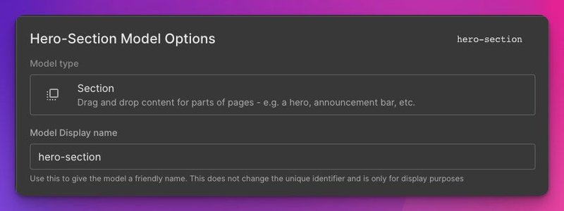
We won’t be needing any fields in this case, as we want it as a block that we might want to swap out and show different variants to users by using targeting.
To get our section showing in the editor, we need to create a component that knows how to render our Builder section:
// src/components/builder-section.tsx

"use client";

import { BuilderComponent, useIsPreviewing, builder } from "@builder.io/react";
import type { BuilderContent } from "@builder.io/sdk";

import "../builder-registry";

interface BuilderSectionProps {
  content?: BuilderContent;
}

// Builder Public API Key set in .env file
builder.init(process.env.NEXT_PUBLIC_BUILDER_API_KEY!);

export function RenderBuilderSection({ content }: BuilderSectionProps) {
  // Call the useIsPreviewing hook to determine if
  // the page is being previewed in Builder
  const isPreviewing = useIsPreviewing();
  // If "content" has a value or the page is being previewed in Builder,
  // render the BuilderComponent with the specified content and model props.
  if (content || isPreviewing) {
    return <BuilderComponent content={content} model="hero-section" />;
  }

  return null;
}
Now we can use it in any page we want to add our hero section:
// src/app/hero-demo/page.tsx

import { RenderBuilderSection } from "@/components/builder";
import { builder } from "@builder.io/react";

builder.init(process.env.NEXT_PUBLIC_BUILDER_API_KEY!);

export default async function Page() {
  const content = await builder
    .get('hero-section', {
      prerender: false,
    })
    .toPromise();

  return (
    <main className="min-h-screen">
      <h1 className="py-20 text-3xl text-center text-teal-500">
        Hero demo page
      </h1>
      { /* This renders our section */}
      <RenderBuilderSection content={content} />
    </main>
  );
}
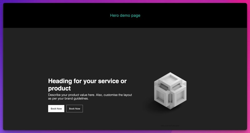
Then we can choose a ready-made hero section template from Builder, publish our change, and they will be rendered in our app:
Next.js combined with Builder.io provides an intuitive and powerful solution for designing and building user interfaces. With the drag-and-drop functionality and the flexibility to use both built-in and custom components, you have the tools to create impressive web pages without the need for extensive coding knowledge.
This isn't some newfangled concept. Companies like Afterpay, Zapier, Adams, and Everlane have already hopped on the bandwagon. Users love real-time collaboration, top-notch performance, and a smorgasbord of integrations.
For teams, it's great. No more drowning in requests to add a button here or change a page layout there. Just pass the baton to the non-dev teams and say, "Hey, you craft your new page, you tweak your pages. I'll be over here creating components and other cool stuff. Just let me do my thing."
To sum it up, adding drag-and-drop page building to Next.js is like adding rocket fuel to your development process. It opens the door to better collaboration and efficiency in building and managing your site. So, why wait? Let's get building!
Tip: Visit our Next.js CMS Hub for more related content.


