A Visual Guide to Layouts in Next.js 14
In our previous article on routing, we explored the concept of pages in Next.js. We learned that a page represents a unique UI for a specific route. However, in many cases, we want to have a consistent layout across multiple pages in our application, such as a header at the top and a footer at the bottom. With the introduction of layouts in the app router, achieving this in Next.js becomes much easier and more flexible.
So, what exactly are layouts? A layout in Next.js is a UI component that is shared between multiple pages in an application. It allows us to define a common structure and appearance for a group of pages, reducing redundancy and promoting code reusability. Since version 13, Next.js provides built-in support for layouts, making it simpler to create and manage them.
To create a layout, we need to define a React component that exports as the default from a file named layout.js or layout.tsx (if you’re using TypeScript). This component should accept a children prop, which will be populated with the content of the child page during rendering. This way, the child page becomes a part of the layout, and we can design a consistent UI around it.
With create-next-app, Next.js also automatically generates a special layout file called layout.tsx in the app folder.
This file serves as the top-most layout, often referred to as the Root layout, and is mandatory for every Next.js application. Even if you delete the layout.tsx file, Next.js regenerates it based on the default layout.
Let's take a closer look at the code within the generated layout.tsx file. The layout component contains a children prop, which represents the child page component rendered within the layout. In the browser's HTML structure, there’s an <html> tag with the lang="english" attribute, followed by a <body> tag. Inside the <body> tag, the page corresponding to the route is rendered.
Here’s the same layout with a Header and Footer component.
The header and footer can be customized according to our needs, providing the desired layout structure and styles. It's important to note that since the layout is applied to every page, the header and footer will be visible regardless of the current route. This means that if we navigate to different pages like /about or /products, the header and footer sections will remain consistent.
In addition to the Root layout, the app router also introduces the concept of nested layouts. This feature allows us to define layouts specific to certain areas of our application.
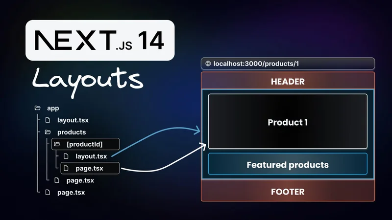
Consider a product details page that dynamically reads the product ID from the route parameters. Here is the folder structure for the dynamic route:
The app folder contains a layout file and the products folder. The products folder, in turn, contains the dynamic [productId] folder.

The page.tsx file in the [productId] folder contains the ProductDetails component. This component receives route parameters as a prop, which is used to display the product ID in the JSX.
If we want to create a layout specifically for the product details page, we can create a separate layout.tsx file within the [productId] folder. The nested layout file can have its own structure and content, tailored specifically to enhance the display of product details pages. Here’s the code for product details layout file:
We define the nested layout as a React component, similar to the Root layout, and it should also accept a children prop. In this case, the children prop represents the content of the product details page. As part of the layout, we render a carousel of featured products.
By nesting layouts, we can create a hierarchy of shared UI components that apply only to specific areas of our application. For instance, the Root layout can contain the main structure, such as the header and footer, while the nested layout within the productId folder can focus on displaying featured products related to that specific product.
With the introduction of layouts in the app router, we gain tremendous flexibility and customization options. We can define consistent UI structures across multiple pages, reduce code duplication, and easily manage the shared components. Nested layouts take this concept even further, enabling us to create specialized layouts for different sections of our application.