
So you've got your nice page and you're adding your background image and…
WAIT!
Did you know that this is going to be very unoptimized for performance? And in more ways than one.
Outside of using SVGs, there's virtually no case where every visitor to your site should receive the exact same image file, given the vast amount of screen sizes and resolutions individuals have these days.
Does your site even work on watches yet? (Kidding…I think)
You could say, "oh! Media queries, I’ll manually specify a range of sizes of screen sizes and images":
Well, there is a problem with this. Besides being quite tedious and verbose, this is only taking screen size into account, but not resolution.
So you could say, "aha! I know a cool trick for this, image-set to specify different image sizes for different resolutions":
And you’d be right, this has some benefits. But, generally speaking, we need to take into account both screen size and resolution.
So we could write some bloated CSS that combined media queries and image-set, but this is just getting complex, and it means we need to know exactly how large our image is for each screen, even as the site layout evolves over time.
And still, this doesn’t support critical things like lazy loading, next-gen formats for supported browsers, priority hints, async decoding, and more.
And to top things off, we also have an issue with chained requests.
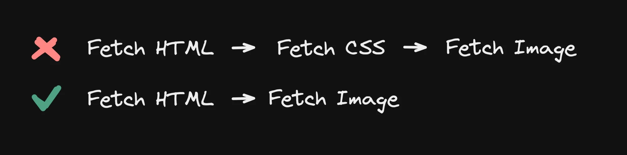
With an image tag, you have the link to the src right in the HTML. So the browser can fetch the initial HTML, scan for images, and begin fetching high-priority images immediately.
In the case of loading images in CSS, assuming you use external stylesheets (link rel=”styleshset”, like most do, instead of inline style everywhere) the browser must scan your HTML, fetch the CSS, and then find that a background-image is applied to an element, and only after all of that can go fetch that image. This will take longer.
And yes, you can work around some things, like inlining CSS, preloading images, and pre-connecting to origins. But, as you read on, you will see additional advantages you get with the HTML img tag that you sadly don’t get with background-image in CSS.
Before we move on to discuss the most optimal way of loading images, we have to remember that like all rules, there are exceptions. For instance, if you have a very small image you want to tile with background-repeat , there isn’t an easy way to accomplish repeating (that I know of) with img tags.
But for any image that is larger than, say, 50px, I would highly suggest avoiding setting it in CSS and instead using an img tag for virtually everything.
Now that we’ve complained about the challenges of using background-image in CSS, let’s talk actual solutions.
In modern HTML, the img tag gives us a number of useful attributes to optimally load images. Let’s run through them.
The first amazing attribute we get on an img tag to improve our image performance is loading=lazy:
This is already a huge improvement, as now your visitors won’t automatically download images that are not even in the viewport. And even better — this has great performance, it’s fully natively implemented by browsers, requires no JS, and is supported by all modern browsers
Note one important detail — ideally, do not lazy load images “above the fold” (that is, images that will be in the browser’s viewport immediately on first load). That will help ensure your most critical images load as soon as possible, and all others will load only as needed.
P.S.: loading=lazy also works on iframes 😍
Using srcset with your images is critical. Unless you are loading an SVG, you need to make sure that different screen sizes and resolutions get an optimally sized image:
One important thing to note is that this is a more powerful version than you get with image-set in CSS, because you can use the w unit in an img srcset.
What is useful about it is that it takes both size and resolution into account. So, if the image is currently displaying 200px wide, on a 2x pixel density device, with the above srcset the browser will know to grab the 400w image (that is, the image that is 400px wide, so it displays perfectly at 2x pixel density). Similarly, the same image on a 1x pixel density image will grab the 200w image.
You may have noticed we’re using a .png in our examples here. This is supported by any browser, but is almost never the most optimal image format.
This is where adding the picture around our img can allow us to specify more modern and optimal formats, such as webp, and supported browsers will favor those, via the source tag:
Optionally, you can support additional formats as well, such as AVIF:
It’s important to keep in mind that we also want to avoid layout shifts. This happens when an image loads if you don’t specify a precise size for the image ahead of the image downloading. There are two ways you can accomplish this.
The first is to specify a width and height attribute for your image. And optionally, but often a good idea, set the images height to auto in CSS so that the image is properly responsive as the screen size changes:
Alternatively, you can also just use the newer aspect-ratio property in CSS to always have the right aspect ratio automatically. With this option, you don’t need to know the exact width and height of your image, just its aspect ratio:
aspect-ratio also pairs great with object-fit and object-position, which are quite similar to background-size and background-position for background images, respectively.
Additionally, you can specify decoding="async" to images to allow the browser to move the image decoding off of the main thread. MDN recommends to use this for off-screen images.
One last, and more advanced option, is fetchpriority. This can be helpful to hint to the browser if an image is extra high priority, such as your LCP image.
Or, to lower the priority of images, such as if you have images that are above the fold but not of high importance, such as on other pages of a carousel:
Yes, alt text is critical for accessibility and SEO, and is not to be overlooked:
Or, for images that are purely presentational (like abstract shapes, colors, or gradients), you can explicitly mark them as presentation only with the role attribute:
One important caveat to srcset attribute mentioned above is that browsers need to know the size an image will render at in order to pick the best sized image to fetch.
Meaning, once the image has rendered, the browser knows its actual display size, multiples that by the pixel density, and fetches the closest possible image in size in the srcset.
But for your initial page load, browsers like chrome have a preload scanner that looks for img tags in the HTML to begin prefetching them immediately.
The thing is - this happens even before the page has rendered. For instance, our CSS hasn't even been fetched yet, so we have no indication as to how the image will display and at what size. As a result, the browser has to make some assumptions.
By default the browser will assume all images are 100vw - aka the full page width. That's anywhere from a little to a whole lot larger than they actually are. So that is far from optimal.
This is where the sizes attribute comes in handy:
With this attribute, we can tell the browser at various window sizes, how large to expect our image to be (either exactly, with an exact pixel value like 500px, or relative to the window, such as 50vw to say it should display around 50% of the window width).
So in the example above, a 900px wide screen will not match either of the first two caluses, and instead match the fallback clause that specifies for larger screens assume the image will display at 50vw.
So since 50vw * 900px = 450px the browser will aim for a 450px wide image for a 1x pixel density display, a 900px wide image for 2x pixel density, etc. It will then look for the closest match in the srcset and use that as the image to prefetch.
Wow, ok, that was a lot. Let’s put it all together.
Here is a great example of a very optimized image for loading:
The above image is a good default, and best for images that may be below the fold.
For your highest priority images, you should remove loading="lazy" and decoding="async" and consider adding fetchpriority="high" if this is your absolute highest priority image, like your LCP image:
Also, for vector formats such as SVG, we don't need to provide multiple sizes and formats, and can just include the below:
Note that we completely removed the <picture> and <source> tags, as well as removed the srcset and sizes attributes, as they are no longer needed.
For high priority SVGs, the same rules mentioned above apply (remove loading and decoding, and optionally add fetchpriority="high" for your LCP image)
Oh yeah, I almost forgot that we started this article by talking about our original use case — a background image.
Now while the image optimization discussed here applies to any type of image you may want to use (such as background, foreground, and so on), it only takes a little bit of CSS (namely some absolute positioning and the object-fit property) to make an img behave like a background-image.
Here is a pared down example you can try yourself:
Yes and no, but mostly no.
It’s easy to forget just how large images are (in terms of bytes). Adding a few bytes to your HTML can save you thousands, or even millions, of bytes on those images by loading much more optimized versions.
Second, let’s not forget that gzipping is a thing. The additional markup you will add for each image quickly becomes very redundant, which is perfectly suited for gzip to deflate away.
So while DOM bloat and payload size definitely should always be a concern, I would suggest that the tradeoffs are in your favor on this one.
These days, you almost never need write all of that stuff by hand. Frameworks like NextJS and Qwik, as well as platforms like Cloudinary and Builder.io, provide image components that make this straightforward, and look instead like the below:
And with that, you can get most, if not all, of the above optimizations (including generating all of those different image sizes and formats), automatically.
Note that that in most cases you still need to specify when an image is high priority, like so:
And in most cases if you want to use the sizes attribute you'll need to specify that manually too. Most of these components allow you to pass through options like that directly, like so:
The only Image component that I know that can automate setting the sizes attribute is the one that I made for Builder.io, as we run a puppeteer script in the background to analyze the actual displayed layout of the image at various screen sizes and can generate that accordingly.
Use img in HTML over CSS background-image whenever you can. Use lazy loading, srcset, picture tags, and the other optimizations we discussed above to deliver images in the most optimal way. Be aware of high-priority as compared to low-priority images and tweak your attributes accordingly.
Or, just use a good framework (like NextJS or Qwik) and/or good platforms (like Cloudinary or Builder.io) and you’ll be covered, the easy way.
Hi! I'm Steve, CEO of Builder.io.
I built our Image component and image optimization API, and have spent an absurd amount of time performance profiling them across hundreds of real world sites and apps.
Our platform is a way to drag + drop with your components to create pages and other CMS content on your existing site or app, visually.
It’s all API driven and has integrations for all modern frameworks. You may find it interesting or useful: