Back in the day, CSS was like a fresh breath, just letting you style a page in a simple, chill way.
It was about setting rules and letting the browser do its thing. You could change up the margins, fonts, and sizes, but that was just scratching the surface, you know?
The real gem was that 'cascade' thing, letting styles inherit and override others, making for some dynamic, cool pages. Fast forward to today, CSS is like a Swiss army knife for web design. It's got the power to animate, transform, and adapt layouts with flexbox and grid, making it all responsive and cool.
From basic styles to complex animations, CSS has evolved into a whole new level of cool. It's not just about simple styling anymore, it's about bringing your whole web game to life.
Let's dive into how CSS got to where it is today (or scroll down to the last section to look into the future 🔮…).
A CSS selector is like a precise instruction in a game of tag. It's a rule that identifies which HTML elements to style. Whether you're pointing to a <div>, .class, or #id, selectors are the messenger of your style declarations, ensuring the correct elements get "tagged".I want you to journey back with me to the early days of CSS. To an era when web design was fresh, raw, and in many ways, restrictive. Remember the old HTML tags like font and center? We used them because we had to, not because we wanted to. And then, like a superhero in a 90s comic book, CSS arrived, and with it came the power of selectors. The original CSS selectors were as basic as the HTML they styled:
It was simple, effective, but very limited. This was like trying to paint the Sistine Chapel with crayons.
To add more flexibility, CSS2 introduced new selectors like child (>), adjacent sibling (+), and attribute selectors ([attr=value]). These allowed for more targeted styling:
These selectors let us express more complex relationships between elements and made our stylesheets more efficient and organized. It was a step forward, but we still needed more.
Enter CSS3. It expanded the CSS selector repertoire with more powerful tools, such as the general sibling combinator (~), the :not() pseudo-class, and a host of attribute selectors:
We were no longer just styling elements; we were engaging with them, probing their attributes, their relationships with each other. We began crafting sophisticated designs that responded to the content's structure and meaning.

CSS3 has brought us pseudo-classes like :nth-child, :nth-of-type, :checked, and ::before and ::after pseudo-elements. Our crayons have become a full artist's palette, and the canvas of the web is richer for it.
Another selector worth mentioning is the :is pseudo-class. It
allows you to group multiple selectors in one statement, reducing repetition
in your code and enhancing readability. For a deeper dive, check out “Simpler CSS Selectors With :is()” by Steve.
Last mention, the :where selector, which is similar to
:is. However, the key difference is that
:where always has 0 specificity.
Selectors have given us the tools to express our creative vision in code. They continue to evolve, driving the web forward into ever more exciting frontiers of design.
The cascade is a defining feature of CSS and, when harnessed properly, can make your stylesheets more efficient and easier to maintain. It refers to the process of combining different stylesheets and resolving conflicts between different CSS rules that apply to the same element.
The concept of specificity plays a crucial role here. An ID selector has higher specificity than a class selector, which has higher specificity than a type selector.
Knowing to work with the cascade, and not against it will save you a ton of problems. Using tools such as a specificity calculator can help go a long way.
One of the key strengths of CSS is its built-in responsiveness through media queries. Media queries help you to apply different styles for different devices or screen widths.
In this example, the background color of the body changes to light blue when the screen width is 600px or less. This makes CSS a major player in creating responsive designs.
Let's take a spin down memory lane and see how media queries in CSS have been keeping things fresh:
- 1994: Our main man Håkon Wium Lie lays down the first idea of media queries. It's the start of something big!
- 1998: CSS2 steps up to the plate and gives us the first taste of media queries.
- 2001: CSS3 comes on the scene, leveling up media queries with some dope new features.
- 2012: Media queries hit the big time! They become a recommended standard by the W3C.
- Right now: Media queries are running things in all the major browsers and have become a key tool in the game of responsive web design.
With CSS3, animations and transitions have become an integral part of the modern web, creating a dynamic user experience. You can animate changes to CSS properties over time, control the speed of transitions, and create keyframe-based animations.
In this snippet, when you hover over a button, its background color transitions to blue over a half-second period.
The CSS Working Group had been aware of the need for CSS variables since its inception in 1997. By the late 2000s, developers had created various workarounds like custom PHP scripts and preprocessors like Less and Sass to compensate for this deficiency.
Recognizing that a built-in solution would streamline the process, the group released the first draft of the CSS variables module in 2012. Renamed as CSS custom properties for cascading variables, it gained widespread browser support by 2017.
Gone are the days of static CSS where updating values was a manual, time-consuming chore. Now, we've got CSS variables in our toolkit, letting us store and reuse specific values throughout our stylesheets. These variables ensure consistency and make updates a breeze.
Here's a taste of CSS variables in action:
Hover over the body, and voila! Your site's look gets a complete makeover. Now that's CSS variables for you!
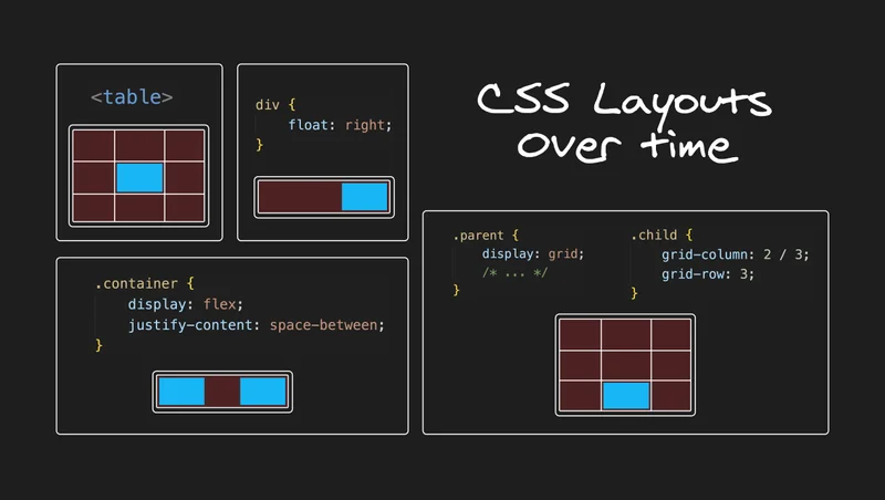
CSS layouts have gone through a lot of changes over the years. Developers used to create layouts with tables and floats, which were hard to maintain and not very responsive. Later, the introduction of media queries, flexbox, and grid revolutionized the way developers create layouts, making them more responsive and easier to maintain. Let’s dig in.
Stepping into the early 2000s, the era of table-based layouts was starting to fade. Remember those times? When we used table, tr, and td to arrange everything on the page, even the layout. Ah, those were some days!
It was a time when we bent HTML to our will, using it for something it wasn't meant for - the layout. But hey, we made it work, right? But let's be real, it was a pain. Code was hard to maintain, accessibility was compromised, and responsiveness was a far-off dream. We needed a change, and CSS was that change!
Ahh, the age of floats. I can almost see the nostalgic smiles and frustrated grimaces on your faces, dear readers. You see, before flexbox came and made our lives a lot easier, we were stuck in Floatsville.
Invented as a simple method for wrapping text around images (think newspaper layouts), floats became an unexpected tool for creating entire web layouts.
And just like that, we had a two-column layout. Easy enough, right? But the problems arose when we tried to add more elements below our floated ones. Suddenly, our footers were on a trip of their own, snuggling up next to content higher up in the DOM. Oh, the chaos!

This was due to a peculiar trait of floated elements. They are partially removed from the normal document flow, meaning elements that follow them in the markup would behave as if the floated element wasn't there.
To fix this, we had to resort to what we now fondly (or not so fondly) refer to as the "clearfix hack". This hack forces the container to expand to contain the floats by creating a new block formatting context.
Here's the famous clearfix hack that's saved many a layout:
By adding an :after pseudo-element to the container, giving it display: table; and clear: both;, we effectively cleared the float. Suddenly, our footers were back where they belonged, and all was right in the world.
Despite its quirks and unexpected behaviors, mastering floats was a rite of passage for every web developer. It taught us the importance of understanding the CSS box model, the document flow, and the weird and wonderful ways CSS could behave. It was a challenging, sometimes hair-pulling experience, but it was a crucial stepping stone on the path to the CSS we know and love today.
The biggest two major game-changers that have improved web dev immensely are: flexbox. These bad boys totally flipped the script on layout design.
First up, flexbox. Introduced in CSS3, flexbox was a straight-up revolution for alignment, direction, order, and size of our boxes. No more float and positioning headaches, y'all. flexbox made it simple to create flexible, responsive layouts with less code and more control. Here's a lil' code sample to show you how it's done:
In this example, we've got a container set to display: flex; which lets its children know they're playing in a flex context. justify-content: space-between; is keeping our items nicely spaced out. Then we hit the items with flex: 1; to make 'em all equal width, filling up the full space of the container. Clean and simple.
Then we got grid, the next big leap. Grid layout, introduced around 2017, took CSS layouts to a whole new level, letting us define both columns and rows at the same time. CSS grid lets us create complex, two-dimensional layouts that were a real pain to pull off before. Here's a taste:
In this piece, .container is our grid container. We define three equal-width columns with grid-template-columns: repeat(3, 1fr); and set a 10px gap between them with grid-gap: 10px;. Then for our items, we use grid-column: span 2; to make an item span two columns. Now that's power!
You can become a real CSS grid wizard if you look into the grid-template-areas property.
Remember the struggle of centering elements both vertically and horizontally? The combination of different properties such as margin, position, top, left, and transform was enough to make anyone's head spin.
Fast forward to today, and flexbox makes centering a piece of cake:
In the past, creating complex layouts often meant resorting to floating elements, which could be finicky and difficult to manage. Here's a simplified example of a two-column layout using floats:
Today, with CSS Grid, you can create complex layouts with minimal code, and without the headaches:
Here’s a more robust and complex layout example:
There are several upcoming features and improvements in CSS that are already stirring up excitement in the web design and development community. You can find a detailed list in “What’s new in CSS and UI”, one of the latest posts by the Chrome team.
Below are some features I’m excited about:
Now supported in all major browsers. Learn more in "Modern CSS for 2024: Nesting, Layers, and Container Queries".
The ability to style a child and control layouts within layouts. You can change elements based on their available space, as can be seen below:
You can play with the above example code in this Codepen.
Due to the container query, the style is dynamic. Changing the size of the viewport triggers a change for each individual element according to the space they have.
The syntax is a bit similar to media queries, except you just define the styles you want in case the container size meets a condition:

This is how it looks like in practice:
Not supported in Firefox & Safari yet
Query the style values of a parent container:
Supported in all major browsers. In Firefox from version 121 (December 19th 2023).
A way to style an element based on its descendants. Basically, you can apply styles according to its children, which means it can act as the elusive parent selector. However, you can style the children within the parent as well.
Currently not supported in Safari.
This new value, like its name, will allow balancing your text, so you don’t have to use JS for this anymore. Adding this to a text block will really make your designers happy.
Supported in all major browsers. Learn more in "Modern CSS for 2024: Nesting, Layers, and Container Queries".
Finally, like SASS and Less, nest and co-locate the styles related to your selector:
Furthermore, you can also nest media queries (and container queries):
Alternatively, the first example could be written as such:
For more info, I suggest checking out this post by Adam Argyle.
Supported in all major browsers.
The missing piece to grid, apply grid layouts to a grid item's children, resulting in more consistent and maintainable layouts. It is used by adding either grid-template-rows or grid-template-columns properties with the subgrid value:
This would result as so:

Still in working draft
Specify the boundaries for which specific styles apply, essentially creating native name-spacing in CSS:
Still experimental.
Control the playback of an animation based on the scroll position of a scroll container. Again, reduces the JavaScript complexity to create parallax scrolling, reading indicators, and more. You can see some neat demos here.
Supported in all major browsers. Learn more in "Modern CSS for 2024: Nesting, Layers, and Container Queries".
Now widely supported, define layers that dictate the order of precedence in case of multiple cascade layers. You can basically order your style sheets by importance:
Not supported in Firefox and Safari
Allows changing the DOM in a single step, while creating an animated transition between the two states. No more need for SPAs (Single Page Apps) to get this done.
There is a need for a bit of JavaScript:
And then CSS takes over:
The future of CSS holds great potential for simplifying complex tasks, improving performance, and enabling developers to create immersive experiences.
As CSS evolves, we may witness the emergence of advanced features that blur the line between CSS and JavaScript, offering native solutions for tasks currently reliant on JS libraries.
Additionally, more comprehensive CSS frameworks could arise, leveraging these new capabilities.
Staying informed about the latest CSS developments is crucial, given its ongoing importance in web design and development. Keeping an eye on updates from the CSS Working Group, following industry leaders, and exploring new features in browser previews will help you stay up to date.
Embrace the exciting possibilities ahead, continue learning, and actively contribute to shaping the future of the web.