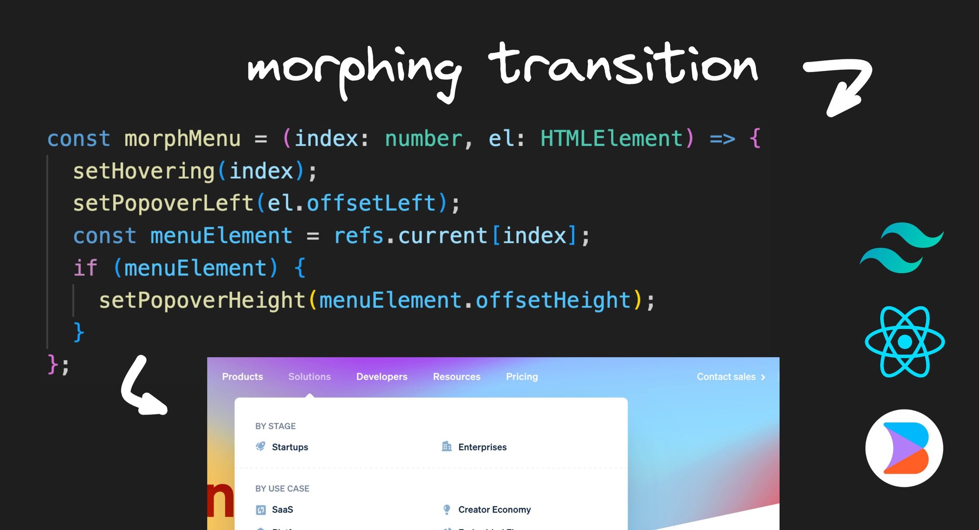
How does Stripe make this awesome morphing menu animation?
Let’s recreate this in React with just a few lines of logic:
const [hovering, setHovering] = useState<number | null>(null);
const [popoverLeft, setPopoverLeft] = useState<number | null>(null);
const [popoverHeight, setPopoverHeight] = useState<number | null>(null);

const refs = useRef<(HTMLElement | null)[]>([]);

const onMouseEnter = (index: number, el: HTMLElement) => {
  setHovering(index);
  setPopoverLeft(el.offsetLeft);
  const menuElement = refs.current[index];
  if (menuElement) {
    setPopoverHeight(menuElement.offsetHeight);
  }
};
We’ll also use AI and Tailwind to create the markup, to quickly go from a basic hello world app to this as our end result:
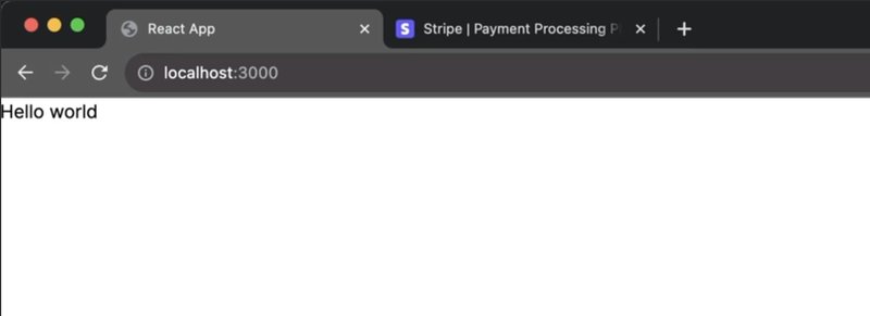
Let's start with a blank React app. You can use Next.js, Remix, or even be a cool kid and use Qwik if you like. Here is where I started:
export default function Home() {
  return <h1>Hello world</h1>;
}
Stunning!
But this is pretty far from looking like what we want, and hand coding an entire Stripe site will take a lot of time.
But thankfully, we have AI to get us 80% of the way there without all that work.
I started with these mockups in Figma, and used the Builder.io plugin to convert them to React + Tailwind code using Visual Copilot.
By just clicking Generate, we get launched into Builder.io, and we can copy the code and paste it into our codebase.
I put it into a new component that I named StripeHero:
export function StripeHero() {
  return /* markup generated by Builder.io */
}
I then import that into my page:
import { StripeHero } from "@/components/StripeHero";

export default function Home() {
  return <StripeHero />;
}
And we get this:

Much better!
Now we want to extract the markup for the navigation links into their own component so we can add our logic to them.
From our StripeHero component, I cut this section out and brought it to a new Nav component:
export function Nav() {
  return (
    <nav className="items-start self-center flex w-[486px] max-w-full justify-between gap-5 my-auto max-md:flex-wrap max-md:justify-center">
      <a
        href="/products"
        className="text-white text-center text-base font-medium leading-6 tracking-wide self-stretch"
      >
        Products
      </a>
      <a
        href="/solutions"
        className="text-white text-center text-base font-medium leading-6 tracking-wide self-stretch"
      >
        Solutions
      </a>
      ... the other links
    </nav>
  );
}
And then back in our StripeHero, we will reference this component instead:
import { Nav } from './Nav'

export function StripeHero() {
  return (
    <>
      ...
      <Nav />
      ...
    </>
  )
}
Now that we didn’t have to waste time generating all of that markup and styling, let's plug in our logic and make those nice interactions.
Going back at our animation we want to copy again:
There are only three things we need to track:
- We need to know which link we’re hovering over. We’ll store that as a number.
- We need to know the left offset that the menu should have, so that it positions itself under the relevant link.
- We need to know the height of the current nav section to show, so we can resize the popover height to match it.
So back in our nav component, let’s add these.
export function Nav() {
  const [hovering, setHovering] = useState<number | null>(null);
  const [popoverLeft, setPopoverLeft] = useState<number | null>(null);
  const [popoverHeight, setPopoverHeight] = useState<number | null>(null);

  return /* the markup generated by Builder.io */
}
Note: There are better ways for managing state than repeated useState hooks like this, such as using reducers, libraries, or custom hooks, but to keep things simple for learning purposes, we’ll stick to useState today.
Now, let's start plugging these in.
On mouse enter of each link, we will set the hovering to the correct index, and when we leave the nav entirely, we will set hovering back to null.
Additionally, when we are hovering over a link, we’ll have a popover show.
export function Nav() {
  // ...
  return (
    <nav onMouseEnter={() => setHovering(null)}>
      <a onMouseEnter={() => setHovering(0)} ...>
        Products
      </a>
      <a onMouseEnter={() => setHovering(1)} ...>
        Solutions
      </a>
      ...
      {typeof hovering === 'number' && (
        <div className="absolute shadow bg-white p-5 rounded w-[600px] ...">
          {/* Our popover */}
        </div>
      )}
    </nav>
  )
}
Now we’ve got a basic popover when we hover links.
Now, let's make it so that when I hover different links, the popover follows us to which link our mouse is over.
To do that, we’ll need to set the popoverLeft value. We can add that to our onMouseEnter callbacks by setting popoverLeft to the event.currentTarget.clientLeft. We can do it for each link like so:
export function Nav() {
  // ...
  const [popoverLeft, setPopoverLeft] = useState<number | null>(null);

  return (
    // ...
      <a
        onMouseEnter={(event) => {
          setHovering(0);
          setPopoverLeft(event.currentTarget.clientLeft);
        }}
        ...
        >
        Products
      </a>
      <a
        onMouseEnter={(event) => {
          setHovering(1);
          setPopoverLeft(event.currentTarget.clientLeft);
        }}
        ...
        >
        Solutions
      </a>
    // ...
  )
}
Stay with me — we’ll refactor this logic later to be less redundant.
Then, we just need to set the left value to the popover itself. We’ll also add a transition-all class so that our popover animates when it moves.
export function Nav() {
  // ...
      {typeof hovering === 'number' && (
        <div
          style={{
            left: popoverLeft ?? 0
          }}
          className="transition-all ...">
          {/* ... */}
        </div>
      )}
    // ...
}
Now it gives us a popover that follows you as expected:
Now, the next thing we need is something to live inside of our popover.
I’m going to go back to our Figma design and use the Builder.io figma plugin to convert each of the popover menus to React + Tailwind code.
Now in VS Code I made components for each Menu and pasted the code in there.
One thing we’ll need to do shortly is to measure the client height of each of these menus. In order to do that, we’ll need access to the underlying DOM node.
In order to provide access to the inner DOM node to a parent component, we’ll wrap each of these components in react’s forwardRef to make this easy.
import { forwardRef } from 'react';

export const Menu3 = forwardRef<HTMLElement>(props, ref) => {
  return (
    <section ref={ref} ...>
      {/* Markup generated by Builder.io */}
    </section>
  )
})
Now, back in our Nav component we can plug the menus into our popover based on which is being hovered like so:
export function Nav() {
  // ...
      {typeof hovering === 'number' && (
        <div ...>
          {hovering === 0 ? (
            <Menu0 />
          ) : hovering === 1 ? (
            <Menu1 />
          ) : hovering === 2 ? (
            <Menu2 />
          ) : hovering === 3 ? (
            <Menu3 />
          ) : null}
        </div>
      )}
    // ...
}
The trick here is we actually need to render all of the menus at once, so we can fade each in and out individually without them popping in and out of the DOM.
So now our Nav component will look like this instead:
Now, this isn’t the prettiest way to show a different view by index, but we will refactor this later.
Also, speaking of keeping your code clean, there is one other ugly thing we do here that we should generally do better.
In reality, you’d generally want to give each of those menus a more descriptive name, like ProductsMenu and SolutionsMenu, but I got lazy and forgot to rename this before building out this example so bear with me and name your own components better. 😄
Now that things are functional, we just need to add the nice animations.
export function Nav() {
  // ...
      {typeof hovering === 'number' && (
        <div ...>
          <Menu0 />
          <Menu1 />
          <Menu2 />
          <Menu3 />
        </div>
      )}
    // ...
}
But of course, we need to overlay each menu so we can fade one into the next. To do so, we’ll make each absolute:
export function Nav() {
  // ...
      {typeof hovering === 'number' && (
        <div ...>
          <div className="absolute">
            <Menu0 />
          </div>
          <div className="absolute">
            <Menu1 />
          </div>
          ...
        </div>
      )}
    // ...
}
Now that they all overlap, we just need to animate the active one.
I’m going to use a handy called clsx that will make it a lot easier to add dynamic classes in React (and the library < 300 bytes).
We’ll use clsx to make the non-active menus opacity-0 and pointer-events-none to make sure they aren’t clickable. We will also transition the opacity (and soon transform) via transition-all.
export function Nav() {
  // ...

      {typeof hovering === "number" && (
        <div ...>
          <div className={clsx(
            "absolute transition-all",
            hovering === 0 ? "opacity-100" : "opacity-0 pointer-events-none"
          )}>
            <Menu0 />
          </div>
          <div className={clsx(
            "absolute transition-all",
            hovering === 1 ? "opacity-100" : "opacity-0 pointer-events-none"
          )}>
            <Menu1 />
          </div>
        </div>
      )}
    // ...
}
Now in our React app, we’ve got our transition, but something is clearly wrong here:
Oh ya! We need to hook up that popoverHeight state we defined earlier. Otherwise, given our inner contents are all position absolute, they break out of the typical document flow and don’t push the popover height to be their height automatically (like they would without position: absolute being set).
So now, back in our nav component, we need to set the popover height.
This is a good time to recognize that our mouseenter listeners are quite redundant, so let's start by refactoring those.
Let’s create a new onMouseEnter function that encapsulates our current logic, like so:
export function Nav() {
  // ...
  const onMouseEnter = (index: number, el: HTMLElement) => {
    setHovering(index);
    setPopoverLeft(el.offsetLeft);
    // We will add the popover height logic here shortly:
    // setPopoverHeight(...)
  };

  // ...
  <a onMouseEnter={(event) => onMouseEnter(0, event.currentTarget)} ...>
    Products
  </a>
  <a onMouseEnter={(event) => onMouseEnter(1, event.currentTarget)} ...>
    Solutions
  </a>
  // etc...
}
Here, we can take the index and anchor element as arguments, and better encapsulate our logic.
Now, we can add our popoverHeight logic directly in here.
But first, we need a reference to the element wrapping the inner contents for each of our menus.
We will use the useRef hook, but because we have a list of menu items, we’ll keep a list of references like so:
export function Nav() {
  // ...
  const refs = useRef<(HTMLElement | null)[]>([]);

  // ...
  <Menu0 ref={element => refs.current[0] = element} />
  // ...
  <Menu1 ref={element => refs.current[1] = element} />
  // etc...
}
We can use ref on each of the Menu components because of the forwardRef we applied to each earlier.
Now that we have refs to all of the root elements of each menu, we can add our height logic to our new onMouseEnter function and set the value as the height style property for our popover.
export function Nav() {
  // ...
  const onMouseEnter = (index: number, el: HTMLElement) => {
    // ...
    const menuElement = refs.current[index];
    if (menuElement) {
      setPopoverHeight(menuElement.offsetHeight);
    }
  };
  // ...

  <div style={{
    left: popoverLeft ?? 0,
    height: popoverHeight ?? 0
  >
  // ...
}
Now things are getting pretty good! We have the popover left and height transitioning, and each menu item fading in.
Now there is one last piece, which is the best part: fading the menus left and right to make them appear to morph from one to the next.
To do this, we need to add some logic to each menu item to transform the menus to the left if it is before the active menu, center if it is active, and right if it is after the active menu.
But first, let's clean up our code a bit.
I’m going to bring the per-menu animation logic to be its own wrapper components where we will pass the menu’s index, hovering index, and children as props:
import clsx from "clsx";

export function SlideWrapper(props: {
  index: number;
  hovering: number | null;
  children: React.ReactNode;
}) {
  return (
    <div
      className={clsx(
        "absolute w-full transition-all duration-300",
        props.hovering === props.index ? "opacity-100" : "opacity-0 pointer-events-none"
      )}
    >
      {props.children}
    </div>
  );
}
Now I can go back and apply this to my Nav component, wrapping each menu, which looks much nicer:
import { SlideWrapper } from './components'

export function Nav() {
  // ...
  <SlideWrapper index={0} hovering={hovering}>
    <Menu0 ref={(ref) => (refs.current[0] = ref)} />
  </SlideWrapper>
  <SlideWrapper index={1} hovering={hovering}>
    <Menu1 ref={(ref) => (refs.current[1] = ref)} />
  </SlideWrapper>
  <SlideWrapper index={2} hovering={hovering}>
    <Menu2 ref={(ref) => (refs.current[2] = ref)} />
  </SlideWrapper>
  <SlideWrapper index={3} hovering={hovering}>
    <Menu3 ref={(ref) => (refs.current[3] = ref)} />
  </SlideWrapper>
  // ...
}
Now, back in our SlideWrapper component, we can add the logic we described, to change the transform based on if this menu is before, after, or equal to the current hovering index:
export function SlideWrapper(props: {
  index: number;
  hovering: number | null;
  children: React.ReactNode;
}) {
  return (
    <div
      className={clsx(
        "absolute w-full transition-all duration-300",
        props.hovering === props.index ? "opacity-100" : "opacity-0 pointer-events-none",
        props.hovering === props.index || props.hovering === null
          ? "transform-none"
          : props.hovering! > props.index
          ? "-translate-x-24"
          : "translate-x-24",
      )}
    >
      {props.children}
    </div>
  );
}
Now we’ve got this amazing end result!
The main focus on this article is how to replicate the animation, but let’s share a couple tips to address accessibility as well.
The way Stripe makes their menu more accessible, is when you focus one of the nav links the dropdown opens and the first link within it gets focused. Using your keyboard up and down keys, the next and previous links get focused respectively.
We can make a couple modifications to solve for this. The first one, is to make sure we trigger the dropdown menu on focus and not just mouseenter.
export function Nav() {
  // ...

  // Renamed from `onMouseEnter`
  const focusMenu = (index: number, el: HTMLElement) => {
    // ...
    const menuElement = refs.current[index];
    if (menuElement) {
      setPopoverHeight(menuElement.offsetHeight);
    }
  };
  // ...

  <a
    onFocus={(event) => focusMenu(0, event.currentTarget)}
    onMouseEnter={(event) => focusMenu(0, event.currentTarget)}
    ...>
    Products
  </a>
  <a
    onFocus={(event) => focusMenu(1, event.currentTarget)}
    onMouseEnter={(event) => focusMenu(1, event.currentTarget)}
    ...>
    Solutions
  </a>

   // etc...
}
Then, within each of our menu components, we can pass an active prop to focus the first link when active, and use onKeyPress to control manually shifting focus to the next and previous links.
function Menu0(props: { active?: boolean }) {
  const linkRefs = useRef<HTMLAnchorElement[]>([]);

  // On mount, focus the first link
  useEffect(() => {
    if (props.active) {
      linkRefs.current[0].focus()
    }
  }, [props.active])

  // On arrow down or up, move to the next/prev focused link
  function onKeyPress(event: KeyboardEvent) {
    const target = event.currentTarget;
    const currentIndex = linkRefs.current.indexOf(document.activeElement);
    if (event.key === 'ArrowDown') {
      const newFocused = linkRefs.current[currentIndex + 1] || linkRefs.current[0];
      newFocused.focus()
    } else if (event.key === 'ArrowUp') {
      const newFocused = linkRefs.current[currentIndex - 1] || linkRefs.current[0];
    }
  }

  // Reset the links array per render
  linkRefs.current = [];
  return (
    <nav onKeyPress={onKeyPress}>
    // ...
    <a ref={el => linkRefs.current.push(el)} ...>
      Link 1
    </a>
    <a ref={el => linkRefs.current.push(el)} ...>
      Link 2
    </a>
    // etc...
  )

}This technique you can now use for any type of menu, with any size of inner contents.
As a bonus, the actual Stripe menus have a nice floating arrow that points to the current link, and can even resize to hold menus of different widths. If you’d like a challenge, try adding that logic as well. It’s not too different than what we have, and adds very nice touches.
As a recap, here are the resources we used so you can build this for yourself too:


