How To Improve Lighthouse Scores by Avoiding <img> Layout Shifts
One of the most common killers of Lighthouse scores, and also one of the easiest to solve, would have to be setting the correct aspect ratio on your images. Layout shifts can happen for many reasons, but here we’ll focus on how images can have a negative effect.
Basically, it’s annoying to be reading content only to see the layout adjust and that same content moved to another location. This is why Lighthouse and other performance measuring tools have a metric called Cumulative Layout Shift, or CLS.
It’s pretty straightforward: if your page has CLS issues, your Lighthouse scores go down.


Another challenge is that we’re also designing pages that are responsive. Meaning that the same content should look good on both desktop and mobile, so setting exact dimensions for images is usually not an option.
Luckily, there are two recommended cross-browser approaches to solving image CLS issues:
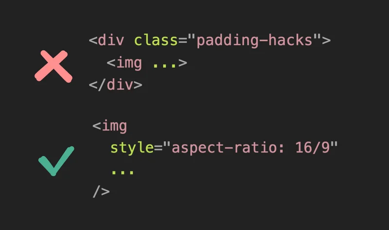
aspect-ratioCSS property onimgselectorwidthandheightattributes in theimgtag, withheight: autoCSS
The aspect-ratio CSS property, as you guessed it, sets the aspect ratio of an element. This means it determines the ratio between the width and height, rather than specifying an image’s exact dimensions.
Here we’re assigning CSS to the img element and using an aspect ratio of 16 units by 9 units.
What’s cool is that even before loading the image, the browser can now reserve space for it. This means that the layout and content of the page will not shift after the image loads.
Depending on your design, it also might be worthwhile to set a background color to the img element so users are given a hint that the image hasn’t loaded yet.
In the screen recording above, you’ll notice that there’s initially a gray square in place of the image, which acts as an image placeholder so the content stays in the same place even after the image loads.
Another recommendation is to also add the object-fit: cover CSS:
The object-fit property tells the browser what to do if the aspect ratio is off. So instead of forcing a poorly stretched image because the ratio is wrong, the image can instead keep its own aspect ratio, and still fit nicely within the given area.
Another approach that’s worth trying for your use case is to set the width and height attribute of the img element, and also the height CSS property to auto.
Similar to the aspect ratio CSS approach, the browser now knows how to calculate how much space the image will take up before it loads.
Which approach you use is up to you, but regardless, if you want an easy way to improve your Lighthouse scores, then ensuring the aspect ratio of your images is a quick win.