The world of mobile development is constantly shifting, and with it comes the need for user interfaces that can adapt to any device or orientation. React Native offers a rich set of tools and techniques to build such interfaces.
In this article, we will explore how to design responsive and adaptive UIs in React Native, with a focus on varying device sizes, orientations, safe areas, and platform-specific code.
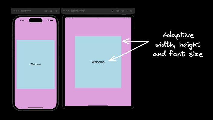
React Native provides components and APIs to adapt to changes in device sizes and orientations. Since users may have different devices ranging from compact phones to larger tablets, it's essential to ensure that the app's UI adapts to these variations.
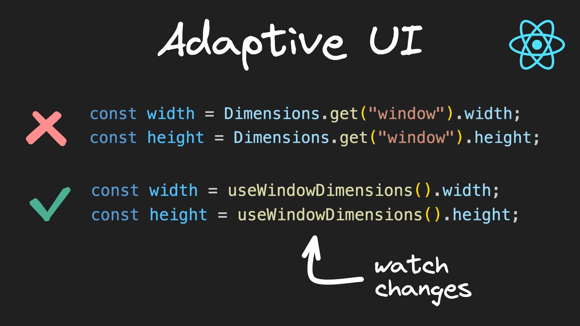
The Dimensions API in React Native allows you to obtain the device's width and height. You can use these values to adapt styles based on the device size. Here's an example:
import { StyleSheet, Dimensions } from "react-native";

const windowWidth = Dimensions.get("window").width;
const windowHeight = Dimensions.get("window").height;

const styles = StyleSheet.create({
  container: {
    width: windowWidth > 500 ? "70%" : "90%",
    height: windowHeight > 600 ? "60%" : "90%",
  },
  text: {
    fontSize: windowWidth > 500 ? 50 : 24,
  },
});
However, the Dimensions API has a drawback: it doesn't dynamically update when the window dimensions change, such as during orientation changes or with foldable phones.
To overcome the limitations of the Dimensions API, React Native introduced the useWindowDimensions hook. This hook simplifies the process of adapting styles that respond to changes in device dimensions. Here's how you can use it:
import { useWindowDimensions } from "react-native";

const windowWidth = useWindowDimensions().width;
const windowHeight = useWindowDimensions().height;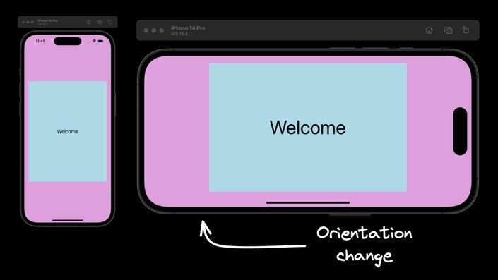
It’s worth noting that useWindowDimensions is the recommended approach to work with device dimensions in React Native.
The SafeAreaView component in React Native ensures that content is rendered within the safe area boundaries of a device. By using SafeAreaView, you can adapt your UI to avoid physical limitations like notches or rounded corners, providing a seamless user experience across different device designs. Here's an example of how to use SafeAreaView:
import { SafeAreaView } from "react-native";

<SafeAreaView style={{ flex: 1 }}>
  {/* Your content here */}
</SafeAreaView>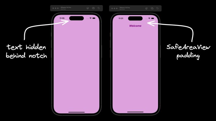
SafeAreaView is a component specific to iOS.
When developing a cross-platform app, you may need to tailor your code to specific platforms. React Native offers two approaches for this, allowing you to adapt your UI to cater to the unique design guidelines and user expectations of different platforms.
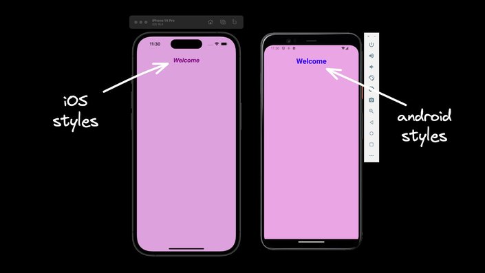
The Platform module detects the platform on which the app is running, so you can implement platform-specific code. You can use Platform.OS for small changes or Platform.select for more comprehensive platform-specific styles. Here's an example:
const styles = StyleSheet.create({
  container: {
    marginTop: Platform.OS === "android" ? 25 : 0,
  },
  text: {
    ...Platform.select({
      ios: { color: "purple", fontSize: 24 },
      android: { color: "blue", fontSize: 30 },
    }),
    fontWeight: "bold",
    textAlign: "center",
  },
});
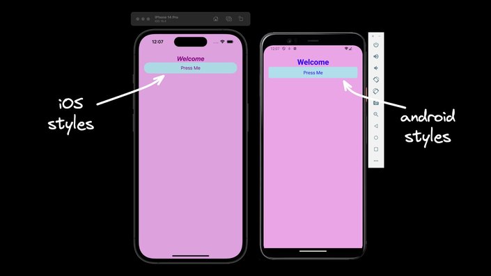
For more complex platform-specific scenarios, you can split your code into separate files with .ios and .android extensions. React Native detects the extension and loads the relevant platform file when required. Here's an example of how you can create a platform-specific button component:
// CustomButton.ios.js
import React from "react";
import { Pressable, Text } from "react-native";

const CustomButton = ({ onPress, title }) => (
  <Pressable
    onPress={onPress}
    style={{
      justifyContent: "center",
      alignItems: "center",
      backgroundColor: "lightblue",
      borderRadius: 20,
      padding: 10,
    }}
  >
    <Text style={{ color: "purple", fontSize: 18 }}>{title}</Text>
  </Pressable>
);

export default CustomButton;

// CustomButton.android.js
import React from "react";
import { Pressable, Text } from "react-native";

const CustomButton = ({ onPress, title }) => (
  <Pressable
    onPress={onPress}
    style={{
      justifyContent: "center",
      alignItems: "center",
      backgroundColor: "lightblue",
      borderRadius: 5,
      padding: 10,
    }}
  >
    <Text style={{ color: "blue", fontSize: 18 }}>{title}</Text>
  </Pressable>
);
Besides the mentioned components and APIs, you might also consider using the LayoutAnimation library for smooth transitions and animations when adapting to different screen sizes and orientations.
Building adaptive user interfaces in React Native requires a deep understanding of the tools and techniques available. By leveraging the Dimensions API, useWindowDimensions hook, SafeAreaView component, and platform-specific coding strategies, you can create responsive and adaptive UIs that provide an optimal user experience across different devices and platforms.


